Lifestyle
How to Start a Web Design Project: Requirements, Content, and Acceptance Testing in Order
Building your first website often stalls over unclear requirements, content, and acceptance criteria, rather than colors. Using an original neighborhood repair studio example, this guide covers user interviews, content preparation, prototyping, development, and handover, with deliverables for each stage. Steps, a comparison table, learning resources, and original diagrams help readers building or commissioning a site turn “Is it finished?” into tasks they can verify.
About 8 min read
Contents
- 1. Reframe desired features as problems to solve
- 2. Gather usable content before letting placeholder text shape the layout
- 3. Use sketches and prototypes to confirm information and interaction order
- 4. Specify interaction states in both visual and development specifications
- 5. Acceptance testing should complete real tasks and record failures
- 6. Hand over a maintainable website and build your own learning path
A neighborhood repair studio wants a website so nearby residents can find its services, decide whether they are a good fit, and submit an inquiry with all the necessary information. If the first discussion focuses only on how attractive the homepage should be, and missing service scope, photo permissions, or inquiry procedures come to light only after the layout is complete, the design will need repeated reworking.
Web design can begin with a clear task: help users find information when they need it and take the next step. The workflow, studio example, and acceptance testing tasks below are original, informed by primary resources from MDN, W3C, and GOV.UK accessed on 2026-9-14. The examples are not presented as completed client projects or actual research findings.
Reframe desired features as problems to solve
Start by talking to actual or potential website users to understand their circumstances: for example, whether residents search for help with leaks on a phone or organize renovation requirements on a computer. Asking how they last found a service, what they needed to confirm, and what worried them reveals more about their needs than directly asking whether they want online booking. Initially mark your own views and the client's views as hypotheses awaiting supporting evidence.
Write the main task as a complete sentence: residents want to know whether the studio serves their area so they can decide whether to make an inquiry. Then list success criteria, such as being able to find the service area, understand which jobs the studio does not accept, and know what happens after an inquiry. These details can guide page design and serve as acceptance criteria at delivery.
Next, define the scope and constraints of the first version. The studio in this original example could initially provide service descriptions and an inquiry form. If appointment scheduling or online payments remain undecided, record them as future requirements. For every added feature, specify the problem it solves, who will maintain it, and how it will be tested for acceptance, providing a basis for discussing the budget and timeline.
Gather usable content before letting placeholder text shape the layout
List the headings, body text, images, contact information, and person responsible for updates for each page. A repair website needs, at minimum, the actual service area, information required for an inquiry, the response method, and project photos that can be used legally. Mark unconfirmed project timelines and prices as pending; designers must not invent commitments just to fill the layout.
Use a content inventory to record the information provider, current version, review status, and source of permission. A clear photo does not automatically mean you can publicly show a customer's home or house number. Confirm the permitted uses and, when necessary, use your own explanatory illustrations instead. Keep records of permitted uses for fonts, icons, and third-party assets too; search results are not permission to use them.
Put real, longer content into early sketches, including complete Traditional Chinese addresses, longer service names, and notes. This helps reveal narrow cards, excessive scrolling on mobile, or insufficient form instructions early. MDN's introductory design workflow also places content and asset preparation before coding, making it useful for practicing with small pages.
Use sketches and prototypes to confirm information and interaction order
First, use sketches to show which information belongs on the same page, which action matters most, and where users will go next. For the original studio example, you could sketch a service overview, an individual service page, and an inquiry confirmation screen without first seeking precise colors for every small section. Focus discussion on whether residents can understand and find things, rather than whether the graphics are polished enough.
When you need to check the flow, connect the screens into a clickable prototype: for example, choosing a service, proceeding to an inquiry, and seeing a confirmation message after completing the information. Invite target users to perform tasks, observe where they pause and why they make their choices, and avoid guiding them through every click. Prototypes help uncover problems, but clicking through does not mean the data actually reaches the studio.
GOV.UK's guidance on early prototypes emphasizes testing important assumptions rather than completing every screen first. When applying this approach to a small website, start with the most uncertain inquiry information or service categories. If the design does not support users in completing their tasks, revisit the content and flow before moving on to visual details.
Specify interaction states in both visual and development specifications
Once the information is confirmed, establish rules for type sizes, spacing, colors, and common components. Buttons need specifications for keyboard focus, disabled, and processing states as well as their normal appearance. Forms also need required-field indicators, errors, and completion results. If you deliver only an ideal homepage, developers still have to guess how other situations should appear.
Planning desktop and mobile layouts involves more than shrinking everything proportionally. Narrower screens may require changes to field arrangements, navigation expansion, and image cropping, while keeping key information and actions easy to find. Confirm content management, form delivery, data storage, and external service requirements with the person building the site before choosing a suitable website-building approach.
W3C's planning resources assign accessibility work to roles such as design, content, and development. In practice, you can check reading order in sketches, contrast and focus during visual design, and labels and keyboard operation during development. Assigning responsibilities early makes the work easier to fit into the original schedule than demanding all corrections at delivery.
Acceptance testing should complete real tasks and record failures
Create specific acceptance testing tasks from the requirements list: find the service area on a phone, submit an inquiry with complete information, and correct an omitted required field. Record the expected and actual results for each task. For forms, also confirm that the studio receives the correct information; a success message on the public-facing page is not enough. Use the planned testing methods for live payment transactions or external notifications.
Also check different screen widths, enlarged text, keyboard operation, links, image alternative text, and error messages. W3C Easy Checks helps identify problems initially, but explicitly does not constitute a complete or definitive accessibility assessment. Automated test scores, conformity to design mockups, and completion of real tasks can all inform your assessment, but none can replace the others.
Defect records should make issues reproducible, specifying the device, page, actions, observed result, and expected result. Fix errors that prevent inquiry submission before addressing smaller visual differences. For deferred items, list their impact, owner, and handling plan instead of covering up known issues with a blanket statement that things are mostly working.
- Conduct interviews and organize the main tasks, then document the first version's scope and success criteria.
- Gather all body text, assets, and permission records, then use sketches and prototypes to confirm the content and flow.
- Complete the interaction states, mobile rules, and content management approach, then implement the pages.
- Perform acceptance testing against tasks, fix problems, and complete the handover of accounts, documentation, maintenance responsibilities, and update procedures.
Hand over a maintainable website and build your own learning path
Besides a browsable website, delivery should include organized information on the domain, hosting, administrator accounts, source code or editable design files, asset permissions, and renewals. Clearly record who updates service content, who receives form submissions, and whom to contact when something fails. Transfer passwords through an appropriate secure channel and avoid sharing a single administrator account long term.
For self-directed learning, start with MDN Curriculum's foundational modules in HTML, CSS, layout, and JavaScript to complete a small service page, then add accessibility and version control. If you use a visual website builder, you can still follow the same path through requirements, content, prototyping, and acceptance testing. Tools lower some production barriers, but you still need to verify the information and user experience yourself.
For each practice project, save the initial requirements, design decisions, test findings, and reasons for changes. Completing an entire flow from reading to making an inquiry teaches you more about how websites serve users than accumulating many unfinished homepages. When adding pages later, you can reuse verified rules and check them again against the new requirements.
Read the full description
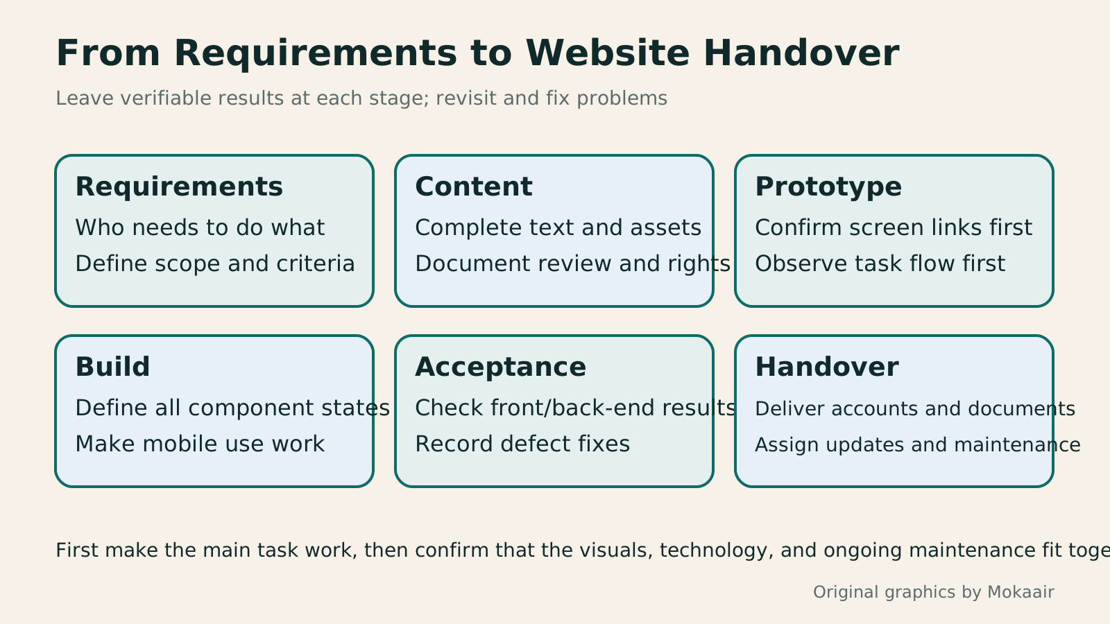
Six cards show requirements, content, prototyping, building, acceptance testing, and handover, illustrating how completing a website requires connecting each stage's deliverables.
| Stage | Deliverables | Questions to check |
|---|---|---|
| Requirements | Main tasks and scope | Who needs to accomplish what? |
| Content | Information, review, and permission inventory | Is all the real content ready? |
| Prototype | Screen relationships and interaction flow | Do users know the next step? |
| Build | Component states and implemented pages | How are errors and mobile use handled? |
| Acceptance testing | Task results and defect records | Are both front-end and back-end results correct? |
| Handover | Accounts, documentation, and maintenance responsibilities | Who will handle future updates and failures? |
Define the commissioned work's scope and acceptance criteria
Understand website flows through readers' tasksCustomer Journeys and Marketing Funnels: Find Where Readers Drop OffCustomer journeys explain touchpoints and needs; marketing funnels count people at each step using consistent criteria. Using an original bicycle repair booking example, this article explains how to map online and offline contacts, define completion events, calculate step conversion rates, and set up GA4 open or closed funnels. A calculation table, practical steps, and original diagrams help identify improvement hypotheses to test without mistaking data gaps for causes of customer drop-off.Read the full article
Plan website content production and updatesPlanning a Content Marketing Calendar Around Reader Questions and UpdatesA content marketing calendar does more than assign publication dates to headlines. It also schedules reader questions, asset production, fact-checking and ownership of updates. Using a fictional fabric shop, this guide turns customer-service questions into an idea bank and plans articles, diagrams and short posts together. A four-week schedule, production steps and an original diagram show how to allow time for review and maintenance, then test whether each piece helps readers complete a task.Read the full article
Found this guide helpful? Share it with someone who needs it
Lifestyle
www, Subdomains, and Subdirectories: Choosing a Website URL Structure
Whether to use www or put a blog at blog.example.com or example.com/blog/ depends on platform support and maintenance. This article explains hostnames and paths, then compares content roles, DNS settings, HTTPS certificates, and URL consistency for subdomains and subdirectories. An original decision table and launch checklist help small websites in Taiwan build URL structures that are easy to use, manage, and hand over.
Lifestyle
Before Hiring a Web Design Agency: The Brief, Quotes and Deliverables Checklist
Before hiring a web design agency, define your site's audience, key actions and deliverables so you can compare quotes. Using a small studio as an example, this guide covers page and template counts, content duties, feature specs, mobile and accessibility checks, account and source-file handover, and post-launch maintenance terms. An editable requirements checklist helps reduce extra costs and communication gaps; no agency recommendations are included.
Lifestyle
Website Caching and CDNs: Which Layer to Clear When Updates Do Not Appear
A website may be updated while phones still show old content because caches remain in different places. Using a Taiwan studio's business-hours update, this article explains browser, WordPress/hosting and CDN roles, cache responses, expiry times and targeted purging. An ordered procedure, comparison table and original diagram help site managers trace old versions while keeping account and shopping workflows correct.
Lifestyle
How to Map Website Structure: From Content Inventory to Navigation and Page Relationships
Website structure is more than a homepage and a few subpages: it helps users know where information is, find it, and understand the next step. An original community equipment-sharing site example covers content inventories, task grouping, navigation labels, page relationships, and tree testing, distinguishing card sorting, site structure diagrams, and Sitemaps for search engines. Steps, a comparison table, and original diagrams help small sites build usable, maintainable information structures.
Articles that cite this one
- How to Organize a Portfolio Website: Show Problems and Outcomes Through Case Studies
- How to Map Website Structure: From Content Inventory to Navigation and Page Relationships
- Information Hierarchy in Web Layouts: Whitespace, Alignment, and Reading Order
- Responsive and Adaptive Websites: Planning Layouts for Mobile Reading
- Figma Design Basics: Frames, Components and Collaborative Handoff
- UI and UX for Beginners: Interfaces, Tasks and User Research
- How to Use Wireframes and Prototypes: Validate Flows Before Refining Visuals
- How to Use Sass and SCSS: Variables, Modules and Compilation
Sources
- MDN: Website Planning, Sketches, and AssetsChecked:
- MDN: Front-End Learning Curriculum StructureChecked:
- GOV.UK: Understanding User NeedsChecked:
- GOV.UK: Early Prototypes and Assumption TestingChecked:
- W3C: Accessibility Planning and Role ResponsibilitiesChecked:
- W3C: Initial Accessibility Checks and Their LimitsChecked:
Compiled from the references and verification dates listed above; fares, schedules, product features, and terms can change, so please confirm the latest details on the relevant official website before travelling, booking, or purchasing.