Lifestyle
Figma Design Basics: Frames, Components and Collaborative Handoff
Start learning Figma with one screen you can edit and explain, without building a full design system. Using an original pet-supply borrowing page, this guide explains Frames, layers, Auto layout, main components and instances; shows how to check layouts as content grows; and compares file sharing, basic inspection and Dev Mode. Steps, a comparison table and original diagrams help you prepare a clear design handoff without mistaking a prototype for a working website.
About 8 min read
Contents
- 1. Create a Frame to Give the Screen Clear Boundaries
- 2. Name Layers by Purpose and Use Realistic Text
- 3. Use Auto layout to Handle Longer Text and Spacing
- 4. Turn Repeated Elements into Components with Traceable Links
- 5. Build a Prototype Flow and Gather Feedback with Clear Questions
- 6. A Handoff Needs States and Permissions, Not Just a Link
When you first open Figma, the canvas, layers, Frames and component names may leave you unsure where to begin. Start with a small task: let readers view a pet-supply item available to borrow, read the conditions of use and find where to submit an application. Organizing this screen clearly makes the basic structure easier to understand than designing many pages at once.
The following is an original practice workflow, with features described according to official Figma documentation consulted on 2026-9-14. This article does not actually establish a borrowing service, collect application data or activate paid seats for readers. The illustrations are original conceptual drawings, not screenshots of Figma in use.
Create a Frame to Give the Screen Clear Boundaries
First, create a design file in Figma Design, give it a name that identifies its purpose and create the screen you want to practice with. A Frame is a container for text, shapes, images and other Frames. It can represent an entire page or a smaller section, such as a card or button.
Select the Frame tool or press F to draw a Frame of any size on the canvas, or choose a preset size. A preset is only a starting point; it does not mean your website only needs to support that device. Naming the screen Borrowing Details makes discussion easier than keeping an automatically generated name. Later, add a narrower version to observe how the content changes.
After placing the item name, illustration, borrowing conditions and application button inside the Frame, check that their layers are actually indented beneath the container in the left panel. Appearing visually inside the Frame does not necessarily mean the layer relationships are correct. Understanding parent and child layers helps you know which objects will be affected together when you move, resize or export them.
Name Layers by Purpose and Use Realistic Text
Label layers with names such as Item Name, Borrowing Conditions and Application Button so you and your collaborators understand each object's role. Organize decorative shapes separately to avoid mixing them with interactive controls. If you select the wrong object, check the layer hierarchy first instead of repeatedly dragging on the canvas and moving other content.
When testing layouts, use Traditional Chinese text of realistic lengths, such as longer item names and complete borrowing reminders. Short headings and a single line of placeholder text may hide future problems with wrapping, truncation or unbalanced spacing. Clearly mark images as placeholders or confirmed assets as well, so temporary images are not mistaken for final deliverables.
Establish the hierarchy of headings, body text and interactive controls before adjusting decorations. Check the contrast between text and backgrounds, and do not rely on color alone to indicate whether a button is available. Include these reading requirements in the design notes so the implementation team can understand them, rather than expecting them to infer the rules from appearance alone.
Use Auto layout to Handle Longer Text and Spacing
After selecting the content you want to arrange, press Shift + A to add Auto layout. It arranges child objects according to direction, spacing, padding and alignment, adjusting as content grows or dimensions change. Start by arranging the borrowing conditions vertically, then combine the whole card with the button.
Hug contents lets an Auto layout container resize according to its content and padding; Fill container lets its child objects fill the available space; Fixed width or height maintains a specified dimension. The settings depend on whether you have selected the container or a child object, and whether you are adjusting width or height. Memorizing one option's name is not enough to apply it everywhere.
Replace the item name with longer text, add a second paragraph of conditions and narrow the outer Frame. Observe whether the button gets squeezed out and whether the body text wraps sensibly. If problems appear, check the sizing and arrangement settings layer by layer. Auto layout can express layout rules, but the design file itself does not automatically implement responsive code for the production website.
Turn Repeated Elements into Components with Traceable Links
When the same button or item card begins appearing repeatedly, you can turn the design into a component. The main component defines the shared structure and appearance, while instances are linked versions you can use on different screens. This makes consistency easier to maintain than repeatedly copying groups of unrelated layers.
For example, the borrowing button can use the same component on the details and list pages, while its text or permitted properties can be adjusted as needed. When changing the main component, check how instances update and how overrides behave. Do not assume every locally modified property will synchronize as-is. Before detaching an instance, consider whether it really needs to be maintained independently.
Using components within the same file is sufficient for beginner exercises. Sharing across files involves publishing a Library, user permissions and plans; official documentation currently lists Library features under paid plans. Clearly document the names and purposes of a few components first, then decide whether wider sharing is needed, to avoid creating a component library nobody knows how to use.
Build a Prototype Flow and Gather Feedback with Clear Questions
Link Frames such as Borrowing Details and Application Prompts into a prototype to discuss what users will see after selecting a control. In the exercise, include at least a way to go back and any necessary prompts, and mark sections that have not yet been designed. A prototype demonstrates interaction ideas; it does not mean data has been saved, payments have been integrated or permissions have been verified.
During testing, ask participants to find the borrowing conditions and explain how to submit an application, observing whether they can locate the necessary information. Do not only ask whether the screen looks good, or point to the button and teach them how to use it first. Record your observations, participants' statements and your own assumptions separately so you know which problem to address when making changes.
You can complete this workflow in your own draft first, progressing from a single screen and variable content to components and interactions. Check the areas affected by every change. If you only add pages without confirming content relationships, the eventual handoff may still lack success, error or no-data states.
- Create a design file and Frame, and confirm the layer relationships among text, images and buttons.
- Test layouts with realistic content lengths, then configure Auto layout and sizing behavior.
- Organize repeated elements into main components and instances, and add the necessary states.
- Connect the prototype, record questions awaiting confirmation and check sharing permissions before preparing the handoff.
A Handoff Needs States and Permissions, Not Just a Link
Before sharing, confirm whether recipients need to view, comment or edit, and check the file or prototype's link settings. Having the link does not necessarily grant access, and a public link cannot limit access to designated people. Ask recipients to use their actual accounts to confirm they can open the correct screen, so insufficient permissions do not come to light on handoff day.
Users with viewing permissions can still perform basic inspection within the allowed scope, such as checking properties and dimensions. Advanced Dev Mode currently requires a paid plan and a Full or Dev seat, with separate rules for some viewing scenarios. It can help compare versions, check development status and view specifications, but does not automatically deliver a complete, tested product.
The handoff should list the current version, screens ready for implementation, unresolved questions, behavior in each state, and image and font sources. Document how to handle loading, failure, empty states and excessively long content, and confirm that exported files are usable. A handoff is truly complete when recipients know what to build, what still needs confirmation and how to refer back to the information.
Read the full description
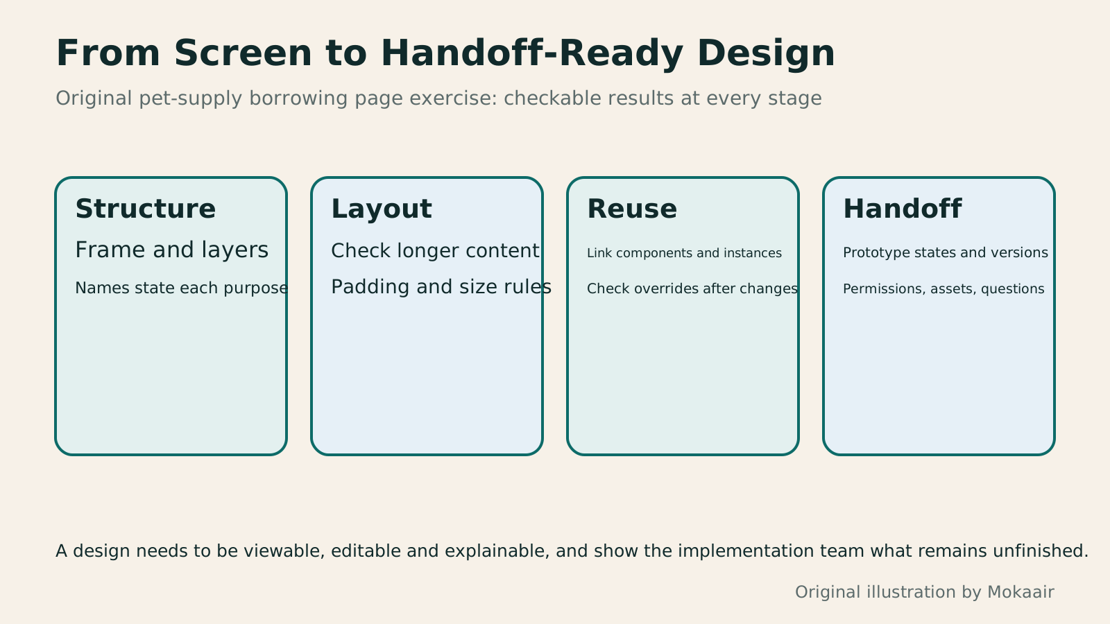
Four cards explain the Figma beginner workflow through Frame structure, content changes, component reuse and handoff states.
| Concept | Use in the Exercise | What to Watch |
|---|---|---|
| Frame | Contains screens and sections | Whether layers are actually inside it |
| Auto layout | Maintains layout spacing as content changes | Parent-child relationships and sizing settings |
| Main component | Defines shared buttons or cards | Naming, purpose and update effects |
| Instance | Reuses components and adjusts permitted properties | Overrides and detaching |
| Prototype | Supports discussion of interactions between screens | Does not equal production data processing |
| Dev Mode | Advanced inspection and developer handoff | Plans, seats and implementation responsibility |
First define the task the prototype should validateHow to Use Wireframes and Prototypes: Validate Flows Before Refining VisualsWireframes, visual mockups, and interactive prototypes serve different purposes. What matters is the question you need to validate now. An original plant care home visit booking scenario shows how to choose fidelity, cover flows and exception states, write tasks without hinting at answers, and turn test observations into change records. Steps, a comparison table, and original diagrams help design beginners and small teams identify usability difficulties before full development.Read the full article
Practice interface hierarchy and reading orderInformation Hierarchy in Web Layouts: Whitespace, Alignment, and Reading OrderA busy page can leave readers unsure where to look first, usually calling for a revised information hierarchy. Using an original used-book swap event page, this article adjusts the main task, heading levels, grid alignment, whitespace, and action buttons step by step, and explains visual versus programmatic reading order. A comparison table, practical steps, and original diagrams help readers turn tidy layouts into pages they can read, understand, and use.Read the full article
Organize the design delivery and acceptance scopeHow to Start a Web Design Project: Requirements, Content, and Acceptance Testing in OrderBuilding your first website often stalls over unclear requirements, content, and acceptance criteria, rather than colors. Using an original neighborhood repair studio example, this guide covers user interviews, content preparation, prototyping, development, and handover, with deliverables for each stage. Steps, a comparison table, learning resources, and original diagrams help readers building or commissioning a site turn “Is it finished?” into tasks they can verify.Read the full article
Found this guide helpful? Share it with someone who needs it
Lifestyle
www, Subdomains, and Subdirectories: Choosing a Website URL Structure
Whether to use www or put a blog at blog.example.com or example.com/blog/ depends on platform support and maintenance. This article explains hostnames and paths, then compares content roles, DNS settings, HTTPS certificates, and URL consistency for subdomains and subdirectories. An original decision table and launch checklist help small websites in Taiwan build URL structures that are easy to use, manage, and hand over.
Lifestyle
Before Hiring a Web Design Agency: The Brief, Quotes and Deliverables Checklist
Before hiring a web design agency, define your site's audience, key actions and deliverables so you can compare quotes. Using a small studio as an example, this guide covers page and template counts, content duties, feature specs, mobile and accessibility checks, account and source-file handover, and post-launch maintenance terms. An editable requirements checklist helps reduce extra costs and communication gaps; no agency recommendations are included.
Lifestyle
How to Start a Web Design Project: Requirements, Content, and Acceptance Testing in Order
Building your first website often stalls over unclear requirements, content, and acceptance criteria, rather than colors. Using an original neighborhood repair studio example, this guide covers user interviews, content preparation, prototyping, development, and handover, with deliverables for each stage. Steps, a comparison table, learning resources, and original diagrams help readers building or commissioning a site turn “Is it finished?” into tasks they can verify.
Lifestyle
Website Caching and CDNs: Which Layer to Clear When Updates Do Not Appear
A website may be updated while phones still show old content because caches remain in different places. Using a Taiwan studio's business-hours update, this article explains browser, WordPress/hosting and CDN roles, cache responses, expiry times and targeted purging. An ordered procedure, comparison table and original diagram help site managers trace old versions while keeping account and shopping workflows correct.
Sources
- Figma: Frames and Layer ContainersChecked:
- Figma: Auto layout and Sizing BehaviorChecked:
- Figma: Main Components and InstancesChecked:
- Figma: Library and Sharing Across FilesChecked:
- Figma: Sharing and Access PermissionsChecked:
- Figma: Scope of Dev Mode UseChecked:
- Figma: Seats and Basic InspectionChecked:
- Figma: Changing and Resetting Instance PropertiesChecked:
Compiled from the references and verification dates listed above; fares, schedules, product features, and terms can change, so please confirm the latest details on the relevant official website before travelling, booking, or purchasing.