Lifestyle
Information Hierarchy in Web Layouts: Whitespace, Alignment, and Reading Order
A busy page can leave readers unsure where to look first, usually calling for a revised information hierarchy. Using an original used-book swap event page, this article adjusts the main task, heading levels, grid alignment, whitespace, and action buttons step by step, and explains visual versus programmatic reading order. A comparison table, practical steps, and original diagrams help readers turn tidy layouts into pages they can read, understand, and use.
About 9 min read
Contents
- 1. First, Decide What Readers Need to Take Away
- 2. Use Headings, Font Sizes, and Weights to Establish Clear Levels
- 3. Use Alignment and Grids to Make Related Content Easy to Scan
- 4. Whitespace Shows Grouping; Contrast Shows Relative Importance
- 5. Preserve Meaningful Reading Order and Room for Adjustment
- 6. Validate Through Reading and Interaction Tasks, Beyond Appearance
A used-book swap event page displays a large poster, an introduction to the organizers, participation rules, and a registration button, each section with a striking background color. Yet after reading it, readers still do not know which books they can bring, when to arrive, or whether they need to register beforehand. With so many things emphasized, the real priorities disappear.
Information hierarchy uses position, size, contrast, and grouping to make the importance of content easy to understand. The event page, layout values, and validation methods below are all original exercises, informed by primary sources from NN/g, W3C, and MDN accessed on 2026-9-14. They are not test results from a real event, nor do they present any particular layout as guaranteed to increase conversion rates.
First, Decide What Readers Need to Take Away
Before changing fonts, prioritize the page's content. The main task of the original event page is to help readers decide whether they can participate, so the event's purpose, time and location, eligible books, and registration method should be easier to find than decorative slogans. The organizing team's story still has value, but it can appear where readers can continue reading after making their main decision.
Write one sentence describing each section's function: what does it help readers decide, or which step does it help them complete? If two sections merely repeat how great the event is, combine them. If cancellation instructions, restrictions on what to bring, or accessible transportation information are missing, add that content first. Information hierarchy cannot give meaning to answers that do not exist.
Next, choose a primary action, such as registering to participate, and a secondary action, such as viewing the exchange rules. You can make the primary button stand out visually, but you must not shrink essential requirements until they are hard to read or mislead readers who have not understood the content into thinking the click merely opens an introduction. The button label should accurately describe what happens next.
Use Headings, Font Sizes, and Weights to Establish Clear Levels
First distinguish the page title, section headings, body text, and supporting notes, then design consistent styles for each role. Headings can be larger or bolder, but not every important sentence needs to become a heading. If an entire paragraph is bold, readers still cannot tell which sentence is a summary and which describes a restriction. Revisit and reorganize the content structure.
For the original exercise, start by comparing body text at 18 pixels, section headings at 24 pixels, and the page title at 36 pixels, then adjust for the typeface, container, and device. These are design starting points, not font sizes prescribed by WCAG or standards for every Traditional Chinese website. Also test whether longer headings obscure content or unbalance the layout when they wrap.
W3C's heading guidance treats heading levels as a way to organize content. Heading elements on a web page should reflect relationships between sections, rather than merely provide larger text. Likewise, making ordinary text bold does not automatically turn it into a heading that assistive technology can understand. Visual styling and content semantics need to be addressed together.
Use Alignment and Grids to Make Related Content Easy to Scan
Think of a grid initially as invisible reference lines: the page's left and right boundaries, column widths, and the starting points of images and text. When dates, locations, and items to bring begin along similar edges on an event page, readers can check them more easily one by one. Arbitrarily offsetting every card increases the effort needed to find information.
For long, horizontally set Traditional Chinese text, start with a consistent leading edge, reserving centering for shorter headings or specific visual sections. Do not manually insert large amounts of whitespace to make both edges perfectly flush, because different devices and fonts may disrupt the spacing. For data that needs tabular relationships, use an appropriate table or a clearly labeled structure.
A grid does not require every page to use the same number of columns. Exchange rules suit continuous reading, event photos can use cards, and a registration form needs a clear input sequence. First decide how each section serves its content, then establish shared boundaries and spacing. Avoid forcing all content into the same kind of box.
Whitespace Shows Grouping; Contrast Shows Relative Importance
Whitespace is not leftover space; it helps readers see which pieces of content belong together. A date label should sit close to its own date, rather than closer to the next group containing the location. In the original exercise, try 12 pixels within groups and 32 pixels between groups to observe the relationships, then adjust for the actual content. The point is the relative difference, not memorizing the numbers.
Borders and background colors can help separate sections, but putting a border around every paragraph makes the page noisier. First try establishing relationships through space, alignment, and headings, adding containers only when further distinction is needed. NN/g's approach to studying visual hierarchy also notes that grouping, scale, and contrast work together to influence attention. No single color is guaranteed to stand out the most in every situation.
Check whether a poster or photo draws attention away from the intended primary action. If a reduced view shows only a large patch of colorful decoration, reconsider the proportions. However, blurred or reduced previews offer only an initial view of the visual center of attention; they cannot prove that text is readable. Important states also need supporting cues such as text or shapes, rather than relying on color alone.
Preserve Meaningful Reading Order and Room for Adjustment
A section that appears in the upper-left corner is not necessarily first in the code. MDN warns that visual reordering with CSS Grid does not automatically change screen reader order or default keyboard navigation order. If registration steps have an intended sequence, simply using CSS to make their positions look attractive may cause keyboard focus to jump suddenly from the page's bottom back to the top.
Make the document's own order sensible first, then arrange the desktop and mobile layouts. W3C's Meaningful Sequence requires the correct reading order to be programmatically determinable when order affects meaning. This does not mean every set of independent sections has only one valid order. The event introduction and organizer information may have different reasonable sequences, while form steps or a passage of text cannot be arbitrarily broken apart.
The layout must also accommodate readers increasing text spacing. W3C Text Spacing requires content and functionality to remain available after applicable text styles are adjusted. The listed line, paragraph, letter, and word spacing values are test conditions, not a requirement for authors to apply all those values by default. Do not use fixed heights that clip overflowing text. For style properties that a language does not use, apply the criterion's exceptions.
Validate Through Reading and Interaction Tasks, Beyond Appearance
After completing a version, ask a target reader to find the eligible books, arrival location, and registration entry point. Observe where they start reading, where they get stuck, and whether they understand the requirements. Do not first tell them where the answers are and then count successful completion as proof that the layout works. Record unclear headings, overlooked reminders, and confusing buttons, then address the content or presentation as appropriate.
Check the same rules with actual long passages, missing images, error messages, and narrower screens. Then navigate by keyboard to confirm that the order is meaningful and focus is visible. After adjusting zoom and text spacing, check whether content overlaps, is clipped, or loses access to controls. Visual tidiness and usability are different outcomes, and both need verification.
At handoff, document text roles, the purpose of spacing, alignment rules, and the styling of the primary action. When adding the next event, editors will then know which content needs headings, which items are reminders, and how much space images should occupy. If new content makes the existing hierarchy ineffective, update the rules instead of forcing it to fit through an ever-growing collection of exceptions.
- List reader tasks and information priorities, and confirm the primary action and essential requirements.
- Define text roles, alignment boundaries, and group spacing, using real content for the initial layout.
- Check the visual emphasis of images and colors, and compare visual and programmatic reading order.
- Validate information finding, keyboard navigation, zoom, and text spacing scenarios, then record and fix problems.
Read the full description
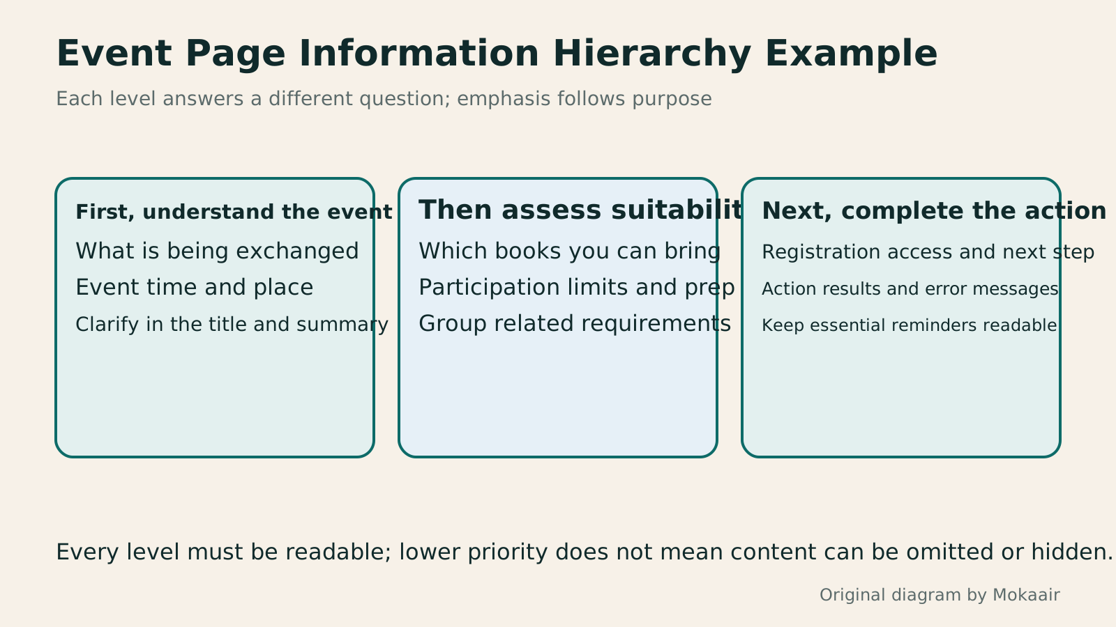
Three cards organize understanding the event, deciding whether to participate, and taking action, showing how to establish a reading hierarchy within one page.
| Layout Symptom | Possible Effect | Original Suggested Adjustments |
|---|---|---|
| Every section is equally prominent | Readers cannot determine priorities | Establish the main task and text roles first |
| A label is closer to the next group | Information is easily matched incorrectly | Reduce spacing within groups and increase spacing between groups |
| Every paragraph is bold with a colored background | Key points compete with one another | Reserve emphasis for the few items that truly need it |
| CSS positions differ from document order | Keyboard navigation or read-aloud order may jump around | Confirm the logical order before arranging the layout |
| Fixed heights clip long text | Information disappears after zooming or adjusting spacing | Allow containers to grow and test the changes |
| Only a homepage screenshot is reviewed | Errors and other content scenarios go untested | Validate with real tasks and multiple states |
Arrange Page Layouts for Different WidthsResponsive and Adaptive Websites: Planning Layouts for Mobile ReadingA website opening on a phone does not ensure small-screen readability. Using an original community course signup page, this article compares responsive and adaptive layouts, content-based breakpoints, and images, forms and navigation at different widths. Steps, a comparison table and original diagrams cover zoom, orientation, keyboard and real-device acceptance checks, helping readers discuss usable pages across devices with designers or developers.Read the full article
Decide on Website Content and Categories FirstHow to Map Website Structure: From Content Inventory to Navigation and Page RelationshipsWebsite structure is more than a homepage and a few subpages: it helps users know where information is, find it, and understand the next step. An original community equipment-sharing site example covers content inventories, task grouping, navigation labels, page relationships, and tree testing, distinguishing card sorting, site structure diagrams, and Sitemaps for search engines. Steps, a comparison table, and original diagrams help small sites build usable, maintainable information structures.Read the full article
Include Page Results in Project Acceptance TestingHow to Start a Web Design Project: Requirements, Content, and Acceptance Testing in OrderBuilding your first website often stalls over unclear requirements, content, and acceptance criteria, rather than colors. Using an original neighborhood repair studio example, this guide covers user interviews, content preparation, prototyping, development, and handover, with deliverables for each stage. Steps, a comparison table, learning resources, and original diagrams help readers building or commissioning a site turn “Is it finished?” into tasks they can verify.Read the full article
Found this guide helpful? Share it with someone who needs it
Lifestyle
www, Subdomains, and Subdirectories: Choosing a Website URL Structure
Whether to use www or put a blog at blog.example.com or example.com/blog/ depends on platform support and maintenance. This article explains hostnames and paths, then compares content roles, DNS settings, HTTPS certificates, and URL consistency for subdomains and subdirectories. An original decision table and launch checklist help small websites in Taiwan build URL structures that are easy to use, manage, and hand over.
Lifestyle
Before Hiring a Web Design Agency: The Brief, Quotes and Deliverables Checklist
Before hiring a web design agency, define your site's audience, key actions and deliverables so you can compare quotes. Using a small studio as an example, this guide covers page and template counts, content duties, feature specs, mobile and accessibility checks, account and source-file handover, and post-launch maintenance terms. An editable requirements checklist helps reduce extra costs and communication gaps; no agency recommendations are included.
Lifestyle
How to Start a Web Design Project: Requirements, Content, and Acceptance Testing in Order
Building your first website often stalls over unclear requirements, content, and acceptance criteria, rather than colors. Using an original neighborhood repair studio example, this guide covers user interviews, content preparation, prototyping, development, and handover, with deliverables for each stage. Steps, a comparison table, learning resources, and original diagrams help readers building or commissioning a site turn “Is it finished?” into tasks they can verify.
Lifestyle
Website Caching and CDNs: Which Layer to Clear When Updates Do Not Appear
A website may be updated while phones still show old content because caches remain in different places. Using a Taiwan studio's business-hours update, this article explains browser, WordPress/hosting and CDN roles, cache responses, expiry times and targeted purging. An ordered procedure, comparison table and original diagram help site managers trace old versions while keeping account and shopping workflows correct.
Articles that cite this one
- How to Organize a Portfolio Website: Show Problems and Outcomes Through Case Studies
- Building a Website Color System: Hue, Lightness, and Readability
- CSS Basics: Selectors, the Box Model, and Layout
- Figma Design Basics: Frames, Components and Collaborative Handoff
- UI and UX for Beginners: Interfaces, Tasks and User Research
- Choosing Between RGB and CMYK: Screens, Print, and File Export
Sources
- NN/g: Visual Hierarchy, Contrast, and GroupingChecked:
- W3C: Headings and Section HierarchyChecked:
- W3C: Meaningful Content SequenceChecked:
- W3C: Text Spacing Adjustments and Applicable ExceptionsChecked:
- MDN: Grid Visual Reordering and AccessibilityChecked:
Compiled from the references and verification dates listed above; fares, schedules, product features, and terms can change, so please confirm the latest details on the relevant official website before travelling, booking, or purchasing.