Lifestyle
CSS Basics: Selectors, the Box Model, and Layout
CSS beginners often find styles fail to apply, cards are wider than expected, or longer text overlaps. Using an original workshop event card, this article starts with reading selectors and declarations, explains how content, padding, border, margin, and box-sizing relate, and outlines uses for normal flow, Flexbox, and Grid. Width calculations, steps, a comparison table, and original diagrams help you build layout exercises to check in a browser.
About 8 min read
Contents
- 1. Understand a CSS rule, then decide what to select
- 2. When styles do not apply, check loading and competing rules first
- 3. Distinguish padding, borders, and margins in the box model
- 4. Start with normal flow, then choose a layout method
- 5. Find layout problems by making content longer
- 6. Verify layouts using actual computed values
CSS controls how web pages look, including text, colors, spacing, and arrangement. You do not need to memorize every property before you start learning. Begin with an event card: make the title clear, keep content away from the edges, and leave space between cards. Then understand what each rule changes.
The workshop event cards and values below are original practice examples. The syntax and box model explanations are based on MDN documentation consulted on 2026-9-14. This article provides checks readers can perform; it does not claim that compatibility testing has been completed in every browser.
Understand a CSS rule, then decide what to select
For example, in .workshop-card { padding: 16px; }, the leading .workshop-card is the selector, which finds elements with the workshop-card class. Inside the braces is a declaration: padding is the property, and 16px is its value. A colon separates the property from its value, and semicolons separate declarations. Spelling and punctuation must be correct.
An element selector such as p affects paragraphs matching that element name. .workshop-card is a class selector that can be reused across multiple cards, while #workshop-list selects the specified ID. IDs should remain unique within an HTML document. For reusable visual styles, classes are usually more convenient than creating an ID for each card.
First give the HTML a sensible content order, such as the event name, time, description, and registration link, then add styles. Enlarging a paragraph with CSS does not automatically make it a semantic heading. Styling an ordinary container to look like a button does not automatically give it a real button's keyboard functionality. Plan appearance and element purpose together.
When styles do not apply, check loading and competing rules first
External stylesheets are usually loaded through an HTML link element, with rel set to stylesheet and href pointing to the correct file. If no styles appear, first check the path, response, and whether the stylesheet actually loaded. If only one property remains unchanged, select the target element and inspect the rules being applied before adding more CSS.
An element may match multiple selectors at once. The browser uses cascade rules to resolve factors such as origin, importance, layers, and specificity. Only when the other relevant conditions are equal does the later declaration determine the result. Do not treat the last rule always wins as a universal principle, or rely solely on repeatedly adding !important to resolve conflicts.
Styles and Computed in browser developer tools help you see which declarations have been overridden and what the actual computed values are. Properties such as text color are often inherited from the parent element, while borders and padding do not simply copy the parent's values. Find where a value comes from before changing it, so fixing one card does not affect the entire website.
Distinguish padding, borders, and margins in the box model
For an ordinary block box, content is the area that holds the content; padding is the space between the content and the border; border surrounds the content and padding; and margin is the space outside the border between the box and other boxes. To keep text away from the edge of its background, usually adjust padding. To separate a card from nearby objects, check margin or container spacing.
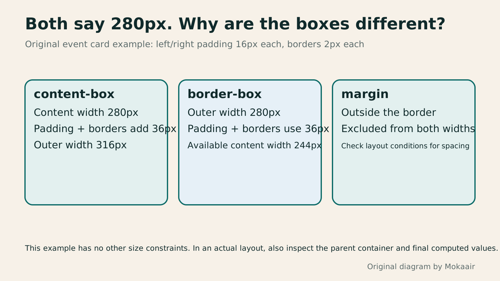
With content-box, width specifies the content width. In this original example, width is 280px, left and right padding are 16px each, and left and right border widths are 2px each. The width between the outer border edges is therefore 280+16+16+2+2=316px. Padding and borders on both sides total 36px. margin is excluded from this border dimension but affects the surrounding space.
After switching to box-sizing: border-box, the same width of 280px includes the left and right padding and borders, leaving a content width of 244px in this example. This setting helps you estimate card dimensions, but it does not automatically resolve overflow caused by long URLs, images, or child elements. It also does not include margin in width.
Start with normal flow, then choose a layout method
In a typical document with horizontal writing, blocks stack downward in content order, while inline text elements flow with the text. First make a single card readable in normal flow, then arrange multiple cards side by side. Do not use absolute positioning for everything just to align each position: when text grows, other content may fail to make room.
Flexbox primarily handles arrangement in one direction, making it suitable for button rows inside cards, tags, or toolbars. Grid plans columns and rows together, making it suitable for event card grids that need alignment. Flexbox can also wrap, but the distribution of items across wrapped rows is not equivalent to Grid's shared column tracks. Choose according to your actual alignment needs.
For example, set display: flex, flex-wrap: wrap, and gap: 12px on an action row to arrange its direct children as flex items and allow wrapping. gap controls spacing between items, while padding can still provide space along the container's inner edges. This example is a starting point for practice; you still need to inspect button widths and text lengths in the actual layout.
Find layout problems by making content longer
Start with a short title, then replace it with a long title containing the event name, intended audience, and location. A fixed card height may cause content to be clipped or overlap buttons. Most text areas can grow in height with their content, with a reasonable minimum height set as needed. Do not rely solely on shrinking the font to fit the original dimensions.
Also check images' original proportions and available width. A common exercise uses max-width: 100% with height: auto to keep images within their containers while preserving their proportions. If you use a fixed cropping frame, decide where to crop separately and confirm that people, text, or important information are not cut off.
Adjacent vertical margins of ordinary block boxes collapse under certain conditions, so the space may not equal the sum of the two values. Flexbox and Grid items do not use this form of adjacent margin collapsing. When spacing differs from expectations, first inspect the box model and the container's display rather than using negative margin everywhere to pull elements back into place.
- Create semantic event content in a sensible order, then load the practice stylesheet.
- Use classes to set text color, padding, and borders, and inspect the rules that actually match.
- Compare content-box and border-box dimensions, confirming that margins are counted separately.
- Add multiple cards and long text, then check narrow screens, zooming, and keyboard operation.
Verify layouts using actual computed values
Open developer tools and select the card. Check its content, padding, borders, and margins in the box model, then compare them with your manual calculations. If the displayed width differs, check whether max-width, the parent container, flex shrinking, or other rules affect the final dimensions. Declaring a value does not mean that value alone controls the layout result.
Gradually narrow the window, then enlarge the text and check for unnecessary horizontal scrolling, overlaps, or hidden controls. Use the keyboard to move through actual links and buttons, keeping focus visible. Checking only hover effects may miss situations where keyboard users cannot tell their current position.
After completing the exercise, keep the HTML, CSS, and a short explanation. Record what each selector controls and which dimensions are only examples. When you later encounter frameworks or preprocessors, you can still return to these rules to understand the results. Identifying which box or declaration causes a problem is more useful than memorizing many layout techniques at once.
Read the full description
Three cards compare content-box's 316px width to the outer border edges, border-box's 244px content width, and margin, excluded from width in both.
| Setting | Area or function controlled | Common misconceptions |
|---|---|---|
| padding | Space between content and border | Negative values are not allowed |
| border | Surrounds content and padding | Whether its width is added depends on the box model |
| margin | Space outside the box | Excluded from border-box width |
| content-box | width specifies the content width | In this example, 280px produces an outer width of 316px |
| border-box | width includes padding and borders | In this example, 280px includes 244px of content |
| Flexbox/Grid | Arranges direct child items | Choose according to alignment needs |
Create responsive layouts for different screensResponsive and Adaptive Websites: Planning Layouts for Mobile ReadingA website opening on a phone does not ensure small-screen readability. Using an original community course signup page, this article compares responsive and adaptive layouts, content-based breakpoints, and images, forms and navigation at different widths. Steps, a comparison table and original diagrams cover zoom, orientation, keyboard and real-device acceptance checks, helping readers discuss usable pages across devices with designers or developers.Read the full article
Build a visual hierarchy for text and contentInformation Hierarchy in Web Layouts: Whitespace, Alignment, and Reading OrderA busy page can leave readers unsure where to look first, usually calling for a revised information hierarchy. Using an original used-book swap event page, this article adjusts the main task, heading levels, grid alignment, whitespace, and action buttons step by step, and explains visual versus programmatic reading order. A comparison table, practical steps, and original diagrams help readers turn tidy layouts into pages they can read, understand, and use.Read the full article
Check website colors and text contrastBuilding a Website Color System: Hue, Lightness, and ReadabilityWebsite colors need more than an attractive palette: text, buttons, and states must stay clear across pages. Using an original home repair course site, this article explains hue, chroma, lightness, color relationships, and semantic roles, then calculates text contrast from actual color codes. Steps, a comparison table, and original diagrams help beginners build maintainable color rules, while treating color psychology as a design hypothesis to test.Read the full article
Found this guide helpful? Share it with someone who needs it
Lifestyle
www, Subdomains, and Subdirectories: Choosing a Website URL Structure
Whether to use www or put a blog at blog.example.com or example.com/blog/ depends on platform support and maintenance. This article explains hostnames and paths, then compares content roles, DNS settings, HTTPS certificates, and URL consistency for subdomains and subdirectories. An original decision table and launch checklist help small websites in Taiwan build URL structures that are easy to use, manage, and hand over.
Lifestyle
Before Hiring a Web Design Agency: The Brief, Quotes and Deliverables Checklist
Before hiring a web design agency, define your site's audience, key actions and deliverables so you can compare quotes. Using a small studio as an example, this guide covers page and template counts, content duties, feature specs, mobile and accessibility checks, account and source-file handover, and post-launch maintenance terms. An editable requirements checklist helps reduce extra costs and communication gaps; no agency recommendations are included.
Lifestyle
How to Start a Web Design Project: Requirements, Content, and Acceptance Testing in Order
Building your first website often stalls over unclear requirements, content, and acceptance criteria, rather than colors. Using an original neighborhood repair studio example, this guide covers user interviews, content preparation, prototyping, development, and handover, with deliverables for each stage. Steps, a comparison table, learning resources, and original diagrams help readers building or commissioning a site turn “Is it finished?” into tasks they can verify.
Lifestyle
Website Caching and CDNs: Which Layer to Clear When Updates Do Not Appear
A website may be updated while phones still show old content because caches remain in different places. Using a Taiwan studio's business-hours update, this article explains browser, WordPress/hosting and CDN roles, cache responses, expiry times and targeted purging. An ordered procedure, comparison table and original diagram help site managers trace old versions while keeping account and shopping workflows correct.
Articles that cite this one
Sources
- MDN: Basic CSS selectorsChecked:
- MDN: The box modelChecked:
- MDN: Handling conflictsChecked:
- MDN: Introduction to CSS layoutChecked:
- MDN: Basic concepts of flexboxChecked:
- MDN: Margin collapsingChecked:
- MDN: HTML link elementChecked:
- MDN: Images, media, and form elementsChecked:
Compiled from the references and verification dates listed above; fares, schedules, product features, and terms can change, so please confirm the latest details on the relevant official website before travelling, booking, or purchasing.