Lifestyle
Responsive and Adaptive Websites: Planning Layouts for Mobile Reading
A website opening on a phone does not ensure small-screen readability. Using an original community course signup page, this article compares responsive and adaptive layouts, content-based breakpoints, and images, forms and navigation at different widths. Steps, a comparison table and original diagrams cover zoom, orientation, keyboard and real-device acceptance checks, helping readers discuss usable pages across devices with designers or developers.
About 8 min read
Contents
- 1. Responsive and adaptive: the difference is how layouts change
- 2. Arrange content for narrow screens first, then find the breakpoints you need
- 3. Flexible containers, images and text must work together
- 4. Navigation, tables and forms need rearranging on phones
- 5. Acceptance testing includes zoom and intermediate sizes, not just device screenshots
- 6. Find problems with emulation, then confirm actual use on real devices
On a computer, a community course page has a poster, session details and a signup form, and everything looks complete. On a phone, the poster text becomes too small, the fees require horizontal scrolling to read in full, and the keyboard covers the submit button when it appears. These problems do not automatically disappear just because the website uses a mobile theme.
Responsive design is about making content and interactions fit the available space, rather than merely delivering screenshots at several sizes. The course page, breakpoint examples and acceptance checklist below are all original, based on official MDN, web.dev, W3C and Chrome documentation consulted on 2026-9-14. No performance measurements were made on any specific website or device.
Responsive and adaptive: the difference is how layouts change
Responsive layouts usually combine flexible grids, scalable media and conditional styles so that content adjusts as the available width changes. For example, course cards form a single column on a narrow screen and switch to multiple columns when space allows, while card widths and spacing remain flexible. There are more than just three fixed versions.
Adaptive design often means preparing several layouts in advance, then switching to the appropriate one based on conditions; web.dev's introduction to design illustrates this approach using media queries with fixed-width layouts. Terminology may differ between projects, and both strategies may be combined, so when commissioning a website, ask how the layout behaves between sizes instead of relying solely on abbreviations in the quote.
RWD does not mean there are never breakpoints, and adaptive design does not necessarily mean a separate mobile URL. What matters when comparing them is whether content remains consistent, whether the page works at various widths, and the cost of maintaining multiple presentations. For typical content pages, start by considering a flexible layout; if there are special operating environments, discuss designs that require explicit layout switches.
Arrange content for narrow screens first, then find the breakpoints you need
First, list the information readers must see before signing up: course content, date, location, fees, eligibility and cancellation procedures. Arrange it in a single column that can be read in sequence, and place the main action where readers can find it after understanding the content. Starting with narrow screens forces the team to clarify the information order; it does not assume mobile readers need only a little information.
Gradually widen the page and watch for text lines becoming too long, information spreading too far apart, or enough space to reasonably add columns, then define breakpoints. Also narrow it again to check heading wraps, cramped buttons and form fields. web.dev recommends choosing breakpoints based on content, rather than treating the dimensions of a particular phone or brand as a permanent rule.
For this original exercise, you can provisionally use 720 CSS pixels as a candidate breakpoint for putting the course summary and signup area into two columns, but test 719, 720 and 721, as well as narrower and wider ranges. If actual titles, fonts or fields do not fit, adjust the value; 720 is a design assumption, not an official recommendation or a universal boundary between phones and tablets.
Flexible containers, images and text must work together
In implementation, you can use CSS Grid, Flexbox or another suitable layout method to let columns use the available space and change their arrangement when needed. MDN emphasizes that flexible grids do not require rigid dimensions for every device model. Still, using these technologies does not remove the need to check content: fixed-width child elements can still make the entire page overflow.
Images should scale within their containers while maintaining appropriate proportions, with file dimensions suited to the layout. If a poster contains essential text, also provide the course information as readable body text, rather than making readers enlarge an image to find the date. When cropping photos, check that the subject has not disappeared; a smaller display size does not necessarily mean a smaller downloaded file.
A page needs appropriate viewport settings to prevent mobile browsers from first laying it out at a wider desktop size and then shrinking it. Do not disable user zoom just to keep the page tidy. Include long URLs, addresses and error messages in testing, rather than passing a single preview using only short headings and ideal content.
Navigation, tables and forms need rearranging on phones
Navigation can collapse into a menu, but its opening control must be clear, its contents must remain usable, and names and destinations should stay consistent. Do not transfer essential features that appear only on mouse hover unchanged into a touch environment. A larger screen does not necessarily mean a mouse is used: touchscreen laptops and tablets with external keyboards can also change how people interact.
If a course table contains multiple sessions, consider turning each session into a card so its date, location and fees can be read together. When data must retain its two-dimensional relationships, provide a suitable table area and scrolling cues, rather than simply cutting off the right half. Keep field labels when converting to cards so that numbers retain their meaning.
On narrow screens, forms usually work well with a clear vertical sequence, with labels, input fields and error messages easy to find together. During actual entry, check whether the software keyboard, page scrolling and buttons fixed at the bottom obstruct one another; users must also be able to correct a previous field. A smaller phone screen is no reason to omit fees, cancellation terms or important reminders.
Acceptance testing includes zoom and intermediate sizes, not just device screenshots
For ordinary vertically scrolling content, W3C WCAG's Reflow criterion requires no loss of information or functionality and no two-dimensional scrolling at a width equivalent to 320 CSS pixels; exceptions apply to content whose meaning requires a two-dimensional layout. This is a test condition, not a claim that the world's smallest phone is 320 wide, nor that changing a single width meets all accessibility requirements.
Starting with an available viewport 1280 CSS pixels wide, use 400% zoom to check a content area equivalent to 320, accounting for the effects of actual browser toolbars and scrollbars. Ordinary body text should reflow; assess exceptions for maps or certain tables according to their purpose, and do not hide important fields just to pass a superficial check.
Besides widths on either side of candidate breakpoints, test landscape and portrait orientations, longer text and error states. Complete the menu and signup flow using a keyboard, checking that focus is visible and not obscured by fixed content, then try tapping through on a phone. Record the screen dimensions, steps and expected result for each problem. After fixing it, retest only the affected scenarios and related flows.
- Use actual course content to establish a reading order for narrow screens, retaining all essential information.
- Adjust the width continuously and propose breakpoints where content becomes cramped or too spread out.
- Handle the various states of images, tables, navigation, forms and fixed elements.
- Check intermediate sizes, zoom and keyboard use, then complete main tasks such as signup on real devices.
Find problems with emulation, then confirm actual use on real devices
Chrome DevTools' Device mode lets you adjust the emulated viewport size and emulate some network and processing conditions. After opening the developer tools, switch to the device toolbar and use the Responsive sizing mode to drag or enter the width and height. This quickly reveals the range where a section starts overflowing, without limiting you to switching between preset device names.
Chrome's official documentation also explicitly states that Device mode is an approximation, not the program actually running on that phone. Touch interaction, the software keyboard, mobile browser behavior and hardware performance still need confirmation on real devices. Keep separate records of emulated-page screenshots, successful real-device flows and performance measurements; do not claim that a single preview image means all devices have been tested.
At handoff, retain the layout rules, reasons for breakpoints, exceptional components and testing scope. When courses or translations are added or fonts are changed later, check again with longer content. The maintenance goal of responsive design is to keep content readable and usable after changes, rather than forever preserving the exact appearance of a particular design mockup.
Read the full description
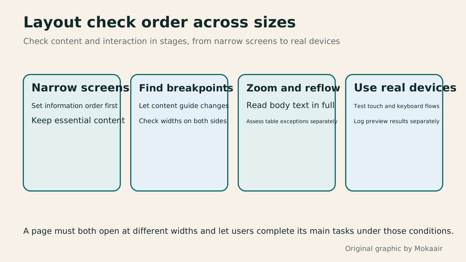
Four cards explain narrow-screen ordering, content-based breakpoints, zoom reflow and real-device use, noting that different acceptance-test results cannot replace one another.
| Approach | How it adapts to space | What to check |
|---|---|---|
| Fixed width | Width stays at a specified value | Whether it forces narrow screens to overflow |
| Flexible layout | Resizes or distributes space based on the container | Overlong text and child-element constraints |
| Adaptive layout | Switches to preset layouts when conditions are met | Whether gaps remain between layouts |
| Responsive layout | Combines flexible media and grids with conditional adjustments | Whether layout and interaction work across a continuous range of sizes |
| Device mode | Emulates dimensions and some conditions | Does not mean actual execution on phone hardware |
| Real-device acceptance testing | Completes tasks on actual devices | Record tested scope and untested limitations |
Plan the complete web design process around requirementsHow to Start a Web Design Project: Requirements, Content, and Acceptance Testing in OrderBuilding your first website often stalls over unclear requirements, content, and acceptance criteria, rather than colors. Using an original neighborhood repair studio example, this guide covers user interviews, content preparation, prototyping, development, and handover, with deliverables for each stage. Steps, a comparison table, learning resources, and original diagrams help readers building or commissioning a site turn “Is it finished?” into tasks they can verify.Read the full article
Organize website content and navigation firstHow to Map Website Structure: From Content Inventory to Navigation and Page RelationshipsWebsite structure is more than a homepage and a few subpages: it helps users know where information is, find it, and understand the next step. An original community equipment-sharing site example covers content inventories, task grouping, navigation labels, page relationships, and tree testing, distinguishing card sorting, site structure diagrams, and Sitemaps for search engines. Steps, a comparison table, and original diagrams help small sites build usable, maintainable information structures.Read the full article
Plan technical checks for actual pagesTechnical SEO audit order: crawling, indexing, rendering, and site structureA useful technical SEO audit needs reproducible evidence and a sensible repair order. Using a site relaunch as an example, this guide explains how to sample page templates and check public access, indexing directives, JavaScript rendering, canonical URLs, and site structure. It separates urgent repairs, scheduled improvements, and later observation so that a general site owner can hand actionable findings to maintainers without treating a passing test as a ranking guarantee.Read the full article
Found this guide helpful? Share it with someone who needs it
Lifestyle
www, Subdomains, and Subdirectories: Choosing a Website URL Structure
Whether to use www or put a blog at blog.example.com or example.com/blog/ depends on platform support and maintenance. This article explains hostnames and paths, then compares content roles, DNS settings, HTTPS certificates, and URL consistency for subdomains and subdirectories. An original decision table and launch checklist help small websites in Taiwan build URL structures that are easy to use, manage, and hand over.
Lifestyle
Before Hiring a Web Design Agency: The Brief, Quotes and Deliverables Checklist
Before hiring a web design agency, define your site's audience, key actions and deliverables so you can compare quotes. Using a small studio as an example, this guide covers page and template counts, content duties, feature specs, mobile and accessibility checks, account and source-file handover, and post-launch maintenance terms. An editable requirements checklist helps reduce extra costs and communication gaps; no agency recommendations are included.
Lifestyle
How to Start a Web Design Project: Requirements, Content, and Acceptance Testing in Order
Building your first website often stalls over unclear requirements, content, and acceptance criteria, rather than colors. Using an original neighborhood repair studio example, this guide covers user interviews, content preparation, prototyping, development, and handover, with deliverables for each stage. Steps, a comparison table, learning resources, and original diagrams help readers building or commissioning a site turn “Is it finished?” into tasks they can verify.
Lifestyle
Website Caching and CDNs: Which Layer to Clear When Updates Do Not Appear
A website may be updated while phones still show old content because caches remain in different places. Using a Taiwan studio's business-hours update, this article explains browser, WordPress/hosting and CDN roles, cache responses, expiry times and targeted purging. An ordered procedure, comparison table and original diagram help site managers trace old versions while keeping account and shopping workflows correct.
Articles that cite this one
- Information Hierarchy in Web Layouts: Whitespace, Alignment, and Reading Order
- Choosing WebP, JPEG or PNG: Let Content Guide Format and Compression
- CSS Basics: Selectors, the Box Model, and Layout
- How to Use Wireframes and Prototypes: Validate Flows Before Refining Visuals
- How to Use Sass and SCSS: Variables, Modules and Compilation
Sources
- web.dev: Fixed, flexible, adaptive and responsive conceptsChecked:
- web.dev: Responsive layouts and content-based breakpointsChecked:
- web.dev: Media queries and breakpoint selectionChecked:
- MDN: Responsive grids and layout techniquesChecked:
- W3C: The Reflow criterion and exceptions for two-dimensional contentChecked:
- Chrome: Device mode features and emulation limitationsChecked:
- W3C: Menu structure across screen sizesChecked:
Compiled from the references and verification dates listed above; fares, schedules, product features, and terms can change, so please confirm the latest details on the relevant official website before travelling, booking, or purchasing.