Lifestyle
Choosing WebP, JPEG or PNG: Let Content Guide Format and Compression
Smaller files take more than lower image quality: check content, transparency, display size and platform support first. With an original cooking-notes page, this article compares WebP, JPEG, PNG and SVG, explains pixel dimensions versus file size, and covers saving originals, exporting candidates and checking images served by the site. A comparison table, steps and original diagrams help preserve text and ingredient detail without a fixed compression ratio or quality value for all images.
About 8 min read
Contents
- 1. First distinguish pixels, display dimensions and file size
- 2. Choose formats separately for photos, transparent images and text images
- 3. Use the same original when comparing quality
- 4. Compare exports in a consistent sequence
- 5. Check the images the website actually delivers
- 6. Save settings for repeatable exports, not just compressed files
A food photo, an illustration with a transparent background and a table of steps can all appear on a web page, but each calls for a different export approach. Saving them all in the same format or always setting quality very low may leave files too large or damage the details readers need to see first.
The following uses a planned original cooking-notes page as an example, based on official image-format and web documentation consulted on 2026-9-14. Dimension calculations explain concepts; no food photography or platform speed testing was performed, and no claim is made that any compression service will always save a fixed percentage.
First distinguish pixels, display dimensions and file size
Pixel dimensions describe how wide and tall an image is; file size describes how much data is needed to store and transmit it. Two images with identical width and height may have different file sizes because their visual detail, format, transparency and encoding settings differ. Identical pixel dimensions alone do not mean two images have the same loading cost.
For example, an original sizing exercise reduces an image from 1600 × 900 to 800 × 450. Both width and height are halved, reducing the total pixel count from 1,440,000 to 360,000, or one-quarter of the original. But the compressed file will not necessarily be exactly one-quarter the size, because format and image content still affect the result.
The width displayed on a website is another matter. High-density screens may need more image pixels than the CSS display width; do not export just one version based on how wide it looks on a phone. First confirm layout and device requirements, then have the website provide suitable candidate sizes instead of serving an oversized original everywhere.
Choose formats separately for photos, transparent images and text images
JPEG is commonly used for static images with varied colors, such as photos. It uses lossy compression, and typical web JPEG files have no transparency channel. JPEG can be a candidate for a photo of a finished dish, but if the image contains small text or sharp edges, carefully check for blurring and block artifacts instead of only viewing the full thumbnail.
PNG supports lossless compression and transparency, making it suitable for raster content that needs clear edges or a transparent background. This does not mean it is uncompressed; its compression method simply does not aim to discard pixel information. Saving an already blurry JPEG as a PNG will not restore details lost earlier.
WebP supports lossy compression, lossless compression and transparency, and can also be used for animation. Major browsers now support it, but you still need to check the upload platform and downstream tools. If a step diagram already consists of vector shapes and text, consider SVG as well; putting a photo inside an SVG does not turn it into a true vector image.
Use the same original when comparing quality
Export candidate files from the original image you have preserved, using identical cropping, dimensions and content, then compare formats and quality settings. If one image is resized and another is sharpened separately, their differences cannot all be attributed to format. For cooking notes, check plate rims, leaf textures, shadow gradients and small text in the image individually.
Quality numbers in different formats or tools do not necessarily mean the same thing. A quality setting of 80 in one tool cannot automatically be interpreted as better than 75 in another, nor does it represent the percentage of original image information retained. Starting with reasonable candidate settings, adjusting gradually and recording file sizes and visible differences is more practical than seeking a universal best number.
Lossless compression preserves the pixel information supplied in that particular input; it does not mean no resizing or lossy processing occurred earlier. Repeatedly re-encoding an already compressed image may accumulate unnecessary losses. When changes are needed, return to the original and export again. Give original assets, editing files and finished website images clear filenames to avoid accidentally overwriting them.
Compare exports in a consistent sequence
First decide the image's purpose: is the food photo meant to show the overall plating, or must readers clearly see how ingredients are cut? A table of steps needs to keep its text readable. Different uses allow different levels of detail loss. If the article requires readers to identify fine details, provide a suitable way to enlarge the image or a text explanation instead of simply compressing the file further.
After exporting, inspect the image both at its actual display size and with details enlarged. The former reflects the normal reading experience; the latter helps reveal blurring, banding, transparency edges and compression artifacts. Also place transparent images against both dark and light backgrounds to check for unexpected white or black borders or a filled-in background.
Record each candidate file's width, height, format, settings and file size, then choose a smaller version that meets readers' needs. This is a comparison for the same purpose; one food photo's results cannot support conclusions for every photo, screenshot and icon. If conversion makes the file larger, review the content and settings rather than forcing yourself to use it.
- Make a copy to preserve the original, and confirm usage rights, cropping and the image's purpose.
- Choose candidate dimensions based on the layout, and select a format suited to the transparency and content.
- Export from the same original, and inspect text, edges, gradients and file size.
- Place the image on the actual page, check the delivered file, display and alt text, then save the settings.
Check the images the website actually delivers
A successful upload does not mean readers receive the file you just selected. The website may create thumbnails, recompress images or convert formats, or it may still reference the large original. Open the Network panel in your browser's developer tools, inspect the actual image requests and transfer sizes, then compare them with where the images appear on the page.
Responsive images can offer candidates in multiple sizes through srcset, with sizes describing their display width in the layout so the browser can choose according to context. These settings do not guarantee that a particular device will always receive a particular file, and they cannot create images that have not been generated. If a site builder generates them for you, still verify that the candidates and layout descriptions make sense.
Format conversion requires a tool to actually re-encode the image; changing the extension from jpg to webp does not make it WebP. During verification, also check mobile browsing, sharing previews and situations that require downloads, because these may use different files or services. If a format is unsupported, provide one acceptable for that use.
Save settings for repeatable exports, not just compressed files
Save each image's original source, usage rights, editing files, export dimensions and settings, and record which article uses it. If you later need to turn a landscape food photo into a portrait cover, you can adjust the crop instead of enlarging an already reduced output. For text diagrams, keeping the vector original also makes content easier to update.
If you use an online compression service, first check how it handles uploaded data. For screenshots containing personal data, unpublished work or client documents, choose tools according to your own data management requirements rather than uploading directly just because a service is free. This is part of choosing a processing method and helps keep the image's content aligned with its use.
File size is one verification item. You also need to confirm that readers can understand the image, transparency is correct, key steps have not been cropped out and alt text supplies the necessary information. Completing format selection, sizing and content checks together creates an image workflow that supports ongoing updates. The next time you replace an image, reuse the checks and compare results again.
Read the full description
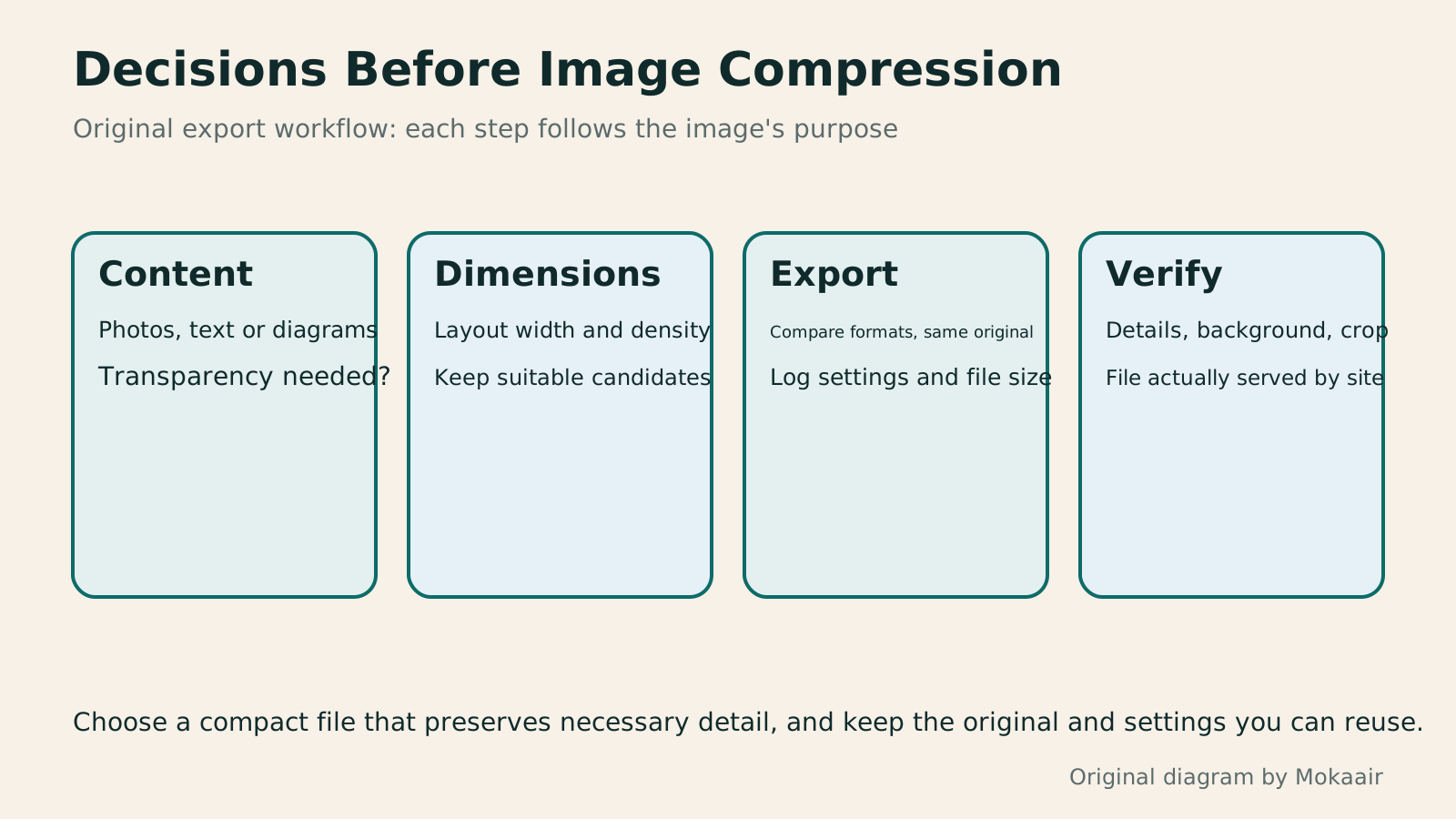
Four cards check content, dimensions, export and verification in order, distinguishing format selection from checks on the actual page.
| Format | Content to consider first | Key checks |
|---|---|---|
| JPEG | Photos and natural gradients | Detail lost in compression; no transparency support |
| PNG | Transparent images, screenshots and sharp edges | File size and actual pixel content |
| Lossy WebP | Web photos and some transparent images | Image quality, transparent edges and platform support |
| Lossless WebP | Content requiring preservation of input pixels | Whether it is actually smaller, and tool settings |
| SVG | Icons and diagrams originally made as vectors | Text, embedded raster images and exported display |
Check image usage rights first
Distinguish color output for web and printChoosing Between RGB and CMYK: Screens, Print, and File ExportThe same event artwork can look vivid on a website but different on a printed flyer. Using original community swap market materials, this article explains RGB, CMYK, color profiles, and soft proofing, with web and print export steps, a handoff comparison table, and original diagrams. It helps general users check the purpose and print conditions before choosing a conversion method, avoiding confusion between profile assignment and conversion or delivery after merely renaming a file.Read the full article
Understand display needs in responsive layoutsResponsive and Adaptive Websites: Planning Layouts for Mobile ReadingA website opening on a phone does not ensure small-screen readability. Using an original community course signup page, this article compares responsive and adaptive layouts, content-based breakpoints, and images, forms and navigation at different widths. Steps, a comparison table and original diagrams cover zoom, orientation, keyboard and real-device acceptance checks, helping readers discuss usable pages across devices with designers or developers.Read the full article
Found this guide helpful? Share it with someone who needs it
Lifestyle
www, Subdomains, and Subdirectories: Choosing a Website URL Structure
Whether to use www or put a blog at blog.example.com or example.com/blog/ depends on platform support and maintenance. This article explains hostnames and paths, then compares content roles, DNS settings, HTTPS certificates, and URL consistency for subdomains and subdirectories. An original decision table and launch checklist help small websites in Taiwan build URL structures that are easy to use, manage, and hand over.
Lifestyle
Before Hiring a Web Design Agency: The Brief, Quotes and Deliverables Checklist
Before hiring a web design agency, define your site's audience, key actions and deliverables so you can compare quotes. Using a small studio as an example, this guide covers page and template counts, content duties, feature specs, mobile and accessibility checks, account and source-file handover, and post-launch maintenance terms. An editable requirements checklist helps reduce extra costs and communication gaps; no agency recommendations are included.
Lifestyle
How to Start a Web Design Project: Requirements, Content, and Acceptance Testing in Order
Building your first website often stalls over unclear requirements, content, and acceptance criteria, rather than colors. Using an original neighborhood repair studio example, this guide covers user interviews, content preparation, prototyping, development, and handover, with deliverables for each stage. Steps, a comparison table, learning resources, and original diagrams help readers building or commissioning a site turn “Is it finished?” into tasks they can verify.
Lifestyle
Website Caching and CDNs: Which Layer to Clear When Updates Do Not Appear
A website may be updated while phones still show old content because caches remain in different places. Using a Taiwan studio's business-hours update, this article explains browser, WordPress/hosting and CDN roles, cache responses, expiry times and targeted purging. An ordered procedure, comparison table and original diagram help site managers trace old versions while keeping account and shopping workflows correct.
Articles that cite this one
Sources
- MDN: Image formats, transparency and use casesChecked:
- Google: WebP format and supportChecked:
- web.dev: Raster images and lossy and lossless compressionChecked:
- web.dev: Image dimensions, density and srcsetChecked:
Compiled from the references and verification dates listed above; fares, schedules, product features, and terms can change, so please confirm the latest details on the relevant official website before travelling, booking, or purchasing.