Lifestyle
Building a Website Color System: Hue, Lightness, and Readability
Website colors need more than an attractive palette: text, buttons, and states must stay clear across pages. Using an original home repair course site, this article explains hue, chroma, lightness, color relationships, and semantic roles, then calculates text contrast from actual color codes. Steps, a comparison table, and original diagrams help beginners build maintainable color rules, while treating color psychology as a design hypothesis to test.
About 8 min read
Contents
- 1. First, Understand What Hue, Chroma, and Lightness Adjust
- 2. Color Relationships Offer Direction, but Do Not Guarantee Readability
- 3. Define Color Rules by Role to Avoid Choosing Colors Again on Every Page
- 4. Check Text Contrast Numerically and Inspect the Actual Rendering
- 5. Icons and States Must Convey Information Through More Than Color
- 6. Treat Color Psychology as a Hypothesis to Test with Content and Feedback
After applying a favorite palette to a website, another problem often emerges: the homepage looks great, but the pale text in the course schedule is hard to read, while the enrollment button and error messages use the same attention-grabbing color. A palette alone does not explain where each color belongs, so rules for usage and validation are also needed.
The following uses an original home repair course website as an example, drawing on MDN, Adobe, and W3C documentation consulted on 9/14/2026. This article selects its own sample color codes and design choices, and calculates contrast values using publicly available formulas. It does not claim that any particular color has increased enrollment or meets all accessibility requirements.
First, Understand What Hue, Chroma, and Lightness Adjust
Hue describes whether a color leans toward red, green, blue, or another direction; chroma describes how gray or vivid it is; lightness helps adjust how light or dark it is. CSS HSL uses hue, saturation, and lightness parameters to represent sRGB colors, so you do not have to guess the result from the three red, green, and blue channels alone.
HSL hue can be expressed as an angle on the color wheel, with opposite hues 180 degrees apart. Adjusting saturation or lightness creates different levels of vividness and lightness within similar hues. These parameters are useful for exploring palettes, but HSL lightness is not the relative luminance used in the WCAG contrast formula. You cannot determine readability simply by subtracting two percentages.
For a home repair course website, you can start with a dark teal hue, then create lighter background variants and darker text variants. First, check whether the same content remains clear when placed on them. Do not accept unreadable combinations just to make every palette value follow a neat pattern. Consistent color codes help with management, but their actual use still needs separate verification.
Color Relationships Offer Direction, but Do Not Guarantee Readability
Monochromatic schemes vary lightness within the same hue; analogous schemes find combinations in neighboring positions on the color wheel; complementary schemes use opposite hues to create differences. These relationships help generate candidate combinations. They do not mean that any combination is inherently suitable for text and backgrounds, and no fixed formula guarantees that everyone will find it harmonious.
Adobe's color wheel tool can generate candidate palettes based on color relationships and also provides access to contrast checking. Start by entering your own base color, then choose the variants you need and record their color codes and roles. If extracting colors from an image, use an image you have the right to use. The extracted colors still need checking in the website's actual context.
On a course page, photos, icons, and notice boxes can all introduce additional colors. You can first keep the main reading area in consistent neutral colors, then decide where a primary or accent color is needed. This is a design choice for this example; no particular area ratio is treated as a rule that every website must follow.
Define Color Rules by Role to Avoid Choosing Colors Again on Every Page
First, list roles such as backgrounds, primary text, secondary text, links, primary actions, and status messages, then assign color codes to them. Names can describe primary text or error messages, instead of simply saying Dark Gray One. When adjustments are needed later, you will know what kind of information each color affects.
The original example can use dark teal #0D6B68 for primary actions and white #FFFFFF for their text, while assigning regular body text a separate dark color suitable for light backgrounds. Primary actions and error messages should have different rules. Even if the brand's primary color is reddish, that does not mean every red can simultaneously represent the brand, special offers, and input errors.
Next, add states such as hover, keyboard focus, selection, and disabled. If there is a dark mode, recheck every text and background pairing instead of simply inverting the original colors. Keep records of color names, codes, suitable backgrounds, and prohibited combinations so new pages can follow the same rules.
Check Text Contrast Numerically and Inspect the Actual Rendering
WCAG 2.2 AA requires a text contrast ratio of at least 4.5:1 for normal text and at least 3:1 for text that meets the large-text definition. Large text refers to 18pt regular or 14pt bold text, or equivalent sizes for Chinese, Japanese, and Korean fonts; check the actual delivered size. Do not apply the lower threshold simply because the text is in a heading field.
This article calculates contrast using opaque sRGB color codes on a pure white background: #777777 is approximately 4.478:1, below the 4.5:1 threshold for normal text; #666666 is approximately 5.742:1 and meets this threshold. Use unrounded values when evaluating the result. Displaying the former as 4.5 does not make it a pass.
Dark teal #0D6B68 has a contrast ratio of approximately 6.325:1 against white, making it a candidate combination for this example. This checks only the specified color pair; transparency, image backgrounds, gradients, and state changes can all alter the result. Font strokes, font size, and the reading environment still affect the experience. Check the actual page instead of relying only on the palette tool's pass indicator.
- Choose a base color that suits the website's content, then explore lighter and darker variants and color relationships.
- List the roles of text, backgrounds, actions, and states, and record their respective color codes.
- Calculate contrast for each actual foreground and background pair, and revise unsuitable combinations.
- Check different screens and interaction states, add text or shape cues, and save the rules.
Icons and States Must Convey Information Through More Than Color
Beyond text, essential graphics used to identify controls or states, or to understand content, have separate non-text contrast requirements. They generally require 3:1 contrast against adjacent colors, with a defined scope and exceptions. This does not mean every decorative line or every pair of brand colors on a website must have a mutual contrast ratio of 3:1. First, determine what information they convey.
For example, course availability should not be indicated only by a green dot for open enrollment and a red dot for a full class. Add text stating that enrollment is open or the class is full. Form errors should also explain which field needs correction, rather than only changing the border color. These cues let people who cannot distinguish certain color differences still understand the page.
Keyboard focus styles must be visible against the actual background. Links can use underlines or another consistently recognizable treatment to distinguish them from regular body text. A grayscale preview helps reveal whether information relies too heavily on hue, but it cannot simulate every visual condition and does not replace a complete accessibility evaluation.
Treat Color Psychology as a Hypothesis to Test with Content and Feedback
A design proposal may aim to convey calm through teal or add liveliness through warm colors. These descriptions can guide team discussions, but they cannot be presented as claims that every Taiwanese reader will trust or buy something upon seeing a certain color. Responses to color also involve content, culture, prior experience, and usage context, so leave room for verification.
For a home repair course page, ask readers to describe the impression the page gives them, then observe whether they can easily find the schedule, fees, and enrollment method. Comparing how color choices affect behavior requires controlling other changes and arranging an appropriate evaluation. If the title, price, and button are changed together, even an increase in enrollment cannot be attributed solely to color.
Finally, compile a single page of color rules covering each role, compatible backgrounds, check dates, and versions. When adding a new event or page, first check whether existing rules can be reused before deciding to add colors. A color system's practical value is in keeping screens consistent, making information easy to recognize, and allowing later changes to be traced.
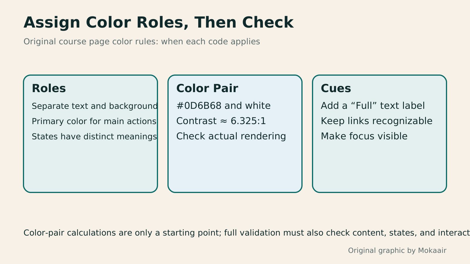
Read the full description
Three original cards cover color roles, color-pair checks, and extra cues, using a candidate dark teal and white pair as an example.
| What to Decide | Available Methods | What Still Needs Checking |
|---|---|---|
| Find candidate colors | Monochromatic, analogous, or complementary schemes | Whether they suit the current content |
| Assign color roles | Separate roles for text, actions, and states | Consistency across pages |
| Check normal text | Actual color pair: at least 4.5:1 | Applicable conditions and the actual font |
| Check essential graphics | Compare adjacent colors and identify their roles | Scope of non-text contrast rules |
| Convey course availability | Color plus text or shapes | Understandable without distinguishing colors |
| Evaluate brand impressions | Form hypotheses and gather feedback | No guarantee of higher conversions |
Build a Reading Hierarchy with Font Sizes and SpacingInformation Hierarchy in Web Layouts: Whitespace, Alignment, and Reading OrderA busy page can leave readers unsure where to look first, usually calling for a revised information hierarchy. Using an original used-book swap event page, this article adjusts the main task, heading levels, grid alignment, whitespace, and action buttons step by step, and explains visual versus programmatic reading order. A comparison table, practical steps, and original diagrams help readers turn tidy layouts into pages they can read, understand, and use.Read the full article
Check Actual Interactions with Prototype TasksHow to Use Wireframes and Prototypes: Validate Flows Before Refining VisualsWireframes, visual mockups, and interactive prototypes serve different purposes. What matters is the question you need to validate now. An original plant care home visit booking scenario shows how to choose fidelity, cover flows and exception states, write tasks without hinting at answers, and turn test observations into change records. Steps, a comparison table, and original diagrams help design beginners and small teams identify usability difficulties before full development.Read the full article
Document Brand Tone and Design HypothesesBrand voice and atmosphere marketing: stay consistent while answering real questionsBrand voice and atmosphere are more than a consistent palette or the same emoji in every sentence. Readers should understand how a brand speaks and serves them across different situations. Using an original rain-gear brand, this guide covers voice principles, visual information hierarchy, situational tone and ways to check understanding. Product launches, instructions, delay notices and an original diagram help teams create coherent content without rigidity or sacrificing readability for mood.Read the full article
Found this guide helpful? Share it with someone who needs it
Lifestyle
www, Subdomains, and Subdirectories: Choosing a Website URL Structure
Whether to use www or put a blog at blog.example.com or example.com/blog/ depends on platform support and maintenance. This article explains hostnames and paths, then compares content roles, DNS settings, HTTPS certificates, and URL consistency for subdomains and subdirectories. An original decision table and launch checklist help small websites in Taiwan build URL structures that are easy to use, manage, and hand over.
Lifestyle
Before Hiring a Web Design Agency: The Brief, Quotes and Deliverables Checklist
Before hiring a web design agency, define your site's audience, key actions and deliverables so you can compare quotes. Using a small studio as an example, this guide covers page and template counts, content duties, feature specs, mobile and accessibility checks, account and source-file handover, and post-launch maintenance terms. An editable requirements checklist helps reduce extra costs and communication gaps; no agency recommendations are included.
Lifestyle
How to Start a Web Design Project: Requirements, Content, and Acceptance Testing in Order
Building your first website often stalls over unclear requirements, content, and acceptance criteria, rather than colors. Using an original neighborhood repair studio example, this guide covers user interviews, content preparation, prototyping, development, and handover, with deliverables for each stage. Steps, a comparison table, learning resources, and original diagrams help readers building or commissioning a site turn “Is it finished?” into tasks they can verify.
Lifestyle
Website Caching and CDNs: Which Layer to Clear When Updates Do Not Appear
A website may be updated while phones still show old content because caches remain in different places. Using a Taiwan studio's business-hours update, this article explains browser, WordPress/hosting and CDN roles, cache responses, expiry times and targeted purging. An ordered procedure, comparison table and original diagram help site managers trace old versions while keeping account and shopping workflows correct.
Articles that cite this one
Sources
- MDN: HSL Hue, Saturation, and LightnessChecked:
- Adobe: Color Wheel and Color Relationship ToolsChecked:
- W3C: Minimum Text Contrast and Relative Luminance FormulaChecked:
- W3C: Information Must Not Rely on Color AloneChecked:
- W3C: Scope of Non-Text ContrastChecked:
Compiled from the references and verification dates listed above; fares, schedules, product features, and terms can change, so please confirm the latest details on the relevant official website before travelling, booking, or purchasing.