Lifestyle
Planning Brand Identity: CIS, Logos and Website Colors
Brand identity connects business ideas, public-facing behavior and visuals; a logo is only one part. Using an original example of a desk-side stationery studio, this guide covers CIS, MI, BI and VI basics, brand briefs, logo use and website color rules, with steps, a comparison table and original diagrams. It helps small brands clarify uses and acceptance criteria before commissioning design, avoiding a delivery of image files without guidelines they can keep using.
About 8 min read
Contents
- 1. Start by viewing CIS as coordinated identity work
- 2. Start the brief with the audience, uses and constraints
- 3. A logo is a recognition element that also needs usage rules
- 4. Turn brand colors and fonts into usable website rules
- 5. Deliver brand voice guidance and asset management together
- 6. Check names and rights before finalizing, then maintain versions
After a studio finishes its new logo, its website, packaging and social media still use different fonts, while its customer service messages sound different from its brand introduction. What needs organizing now goes beyond the logo: everyone needs a shared set of clear rules that helps readers recognize the brand and understand what it offers.
This article uses an original example of a desk-side stationery studio, drawing on identity standards, Adobe brand guidelines and Taiwan Intellectual Property Office materials accessed on 2026-9-14. The example involves no actual commission or brand results. Its requirements, rules and illustrations were all created independently, without using case-study visuals or recommendation rankings from the source websites.
Start by viewing CIS as coordinated identity work
CIS commonly refers to a corporate identity system. Introductory explanations in Taiwan often divide it into philosophical identity (MI), behavioral identity (BI) and visual identity (VI). Nan Kai University of Technology's publicly available identity standards also explain its system through philosophy, behavior and visuals. This is one way to understand identity, not a legally mandated classification that every organization must adopt.
For the stationery studio, its philosophy might be to help users organize their daily work. Its behavior includes answering product questions, explaining order progress and handling stock shortages. Visuals cover the logo, typography, colors and graphics. If its stated philosophy values clarity but its actual product descriptions are vague, a new logo cannot bridge that gap.
Initially, a one-page document can list the values you want people to understand, the service behaviors you can deliver and the visuals that need consistency. You do not need to produce every uniform, vehicle and interior guideline at once simply to call it CIS. Start with the touchpoints you will actually use, then expand as the business develops.
Start the brief with the audience, uses and constraints
Before commissioning design, explain the brand's products or services, its primary audience, its current recognition problems and what you hope to improve. The stationery studio could write: product photography lacks a consistent style, making it hard for readers arriving from social media to tell whether the website belongs to the same shop. This is easier to discuss than simply asking for something premium, minimalist and refined.
Next, list the intended uses, such as the website header, social media avatar, shipping stickers and product information cards. Note their dimensions and shapes, common backgrounds and whether monochrome printing is needed. These conditions affect logo combinations and font choices. Do not wait until the design is finalized to discover that the full name becomes an unreadable line in a small avatar.
Separate what must stay from what can be explored. For example, the brand name may be settled while the graphic direction remains open; existing packaging dimensions may be fixed while the colors can change. When providing references, explain whether you like their clear information, linework or layout, and avoid asking for direct imitation of another brand's identity elements.
A logo is a recognition element that also needs usage rules
A logo can consist of text, graphics or a combination. When choosing, consider whether the full name needs to appear, the display size and the different contexts of use. The stationery studio can first test the readability of its full wordmark in the website header, then assess whether it needs a smaller version for avatars. That smaller version should also be part of the formal design, rather than something each user crops independently.
Guidelines can specify each version's proportions, surrounding clear space, minimum size and suitable backgrounds, with examples showing that it should not be stretched, recolored or given added effects. Determine exact dimensions by testing your own logo. Do not copy someone else's clear-space multiples and treat them as universal design laws for every logo.
If you need monochrome printing, dark backgrounds or partner credits, confirm the corresponding versions in advance. Having only a white-background JPG may limit future website or packaging use, but receiving an SVG does not guarantee that everything is fully editable. Check that the graphics, text and assets inside the file meet the agreement.
Turn brand colors and fonts into usable website rules
Brand colors can build recognition, but a website also needs body text, backgrounds, links, buttons and status messages. Distinguish these uses before specifying compatible color codes and backgrounds. The stationery studio could reserve its primary color for main actions and add clear text for product statuses, avoiding a situation where every prominent color simultaneously means both a promotion and an error.
Website text and controls need their actual contrast checked. A color's presence in the logo does not exempt all body text using it from contrast requirements. Logos serve a different purpose from general brand promotional text; W3C's guidance on text contrast also distinguishes logo exceptions from ordinary content. Design guidelines should provide suitable combinations for both light and dark backgrounds.
Typography rules can specify uses for headings, body text and numbers, while checking Traditional Chinese glyphs, punctuation, fallback fonts for missing characters and licensing. If the brand font is unsuitable for long articles or too costly to load, designate a font for reading. Consistency does not mean using only one font everywhere; it means having a clear basis for each choice.
Deliver brand voice guidance and asset management together
Beyond visuals, prepare examples of tone for product descriptions, order reminders and customer service replies. If the stationery studio wants to communicate clarity and consideration, it should state dimensions, uses and limitations clearly, along with what information it can currently confirm. Do not invent founder stories, customer reviews or nonexistent production processes to make the brand story more moving.
For asset management, use a list to record logo versions, font sources, photo authors, licensing scope and usage locations, so future production staff know whether they can modify or reuse each asset. A publicly downloadable brand manual does not mean its logos, photos or fonts are available for your own commercial use. Their individual rights and rules still apply.
At handover, arrange a short practical exercise: ask someone who was not involved in the design to create a new-product card using the guidelines, then check whether they can find the correct files and instructions. If every step needs a verbal explanation from the designer, add the missing examples to the document so the guidelines can truly support everyday work.
- Define the brand's audience, values and touchpoints, and list its current recognition problems.
- Specify the design's intended uses, fixed conditions, scope for exploration and deliverables.
- Test logo versions, colors and fonts in their actual contexts of use.
- Deliver usable files, rights records and concise guidelines, and assign someone to maintain them.
Check names and rights before finalizing, then maintain versions
Company names, business names, domains and trademarks have different functions and review systems. The Taiwan Intellectual Property Office explains that a company name identifies the business entity, while a trademark identifies the source of goods or services. Obtaining a company name or web address does not mean you have acquired trademark rights. Complete these checks separately before committing to signage, packaging and promotion.
Based on the goods or services you intend to use the identity for, search for identical or similar prior trademarks in both text and graphics. Searching is an early risk check, not a guarantee of approval. A design commission should also specify asset sources, licensing or rights agreements, the permitted scope of modifications and subsequent handover. Payment alone should not be treated as covering every usage right.
Once the guidelines are established, retain version dates and the name of the person responsible, and manage currently usable files in one place. When updating the primary color or logo, list the update order for the website, avatars, packaging and external collaboration assets, and confirm which old materials should be retained or retired. Record the reason for every change so brand identity can be maintained as the business develops, rather than remaining a one-time presentation document.
Read the full description
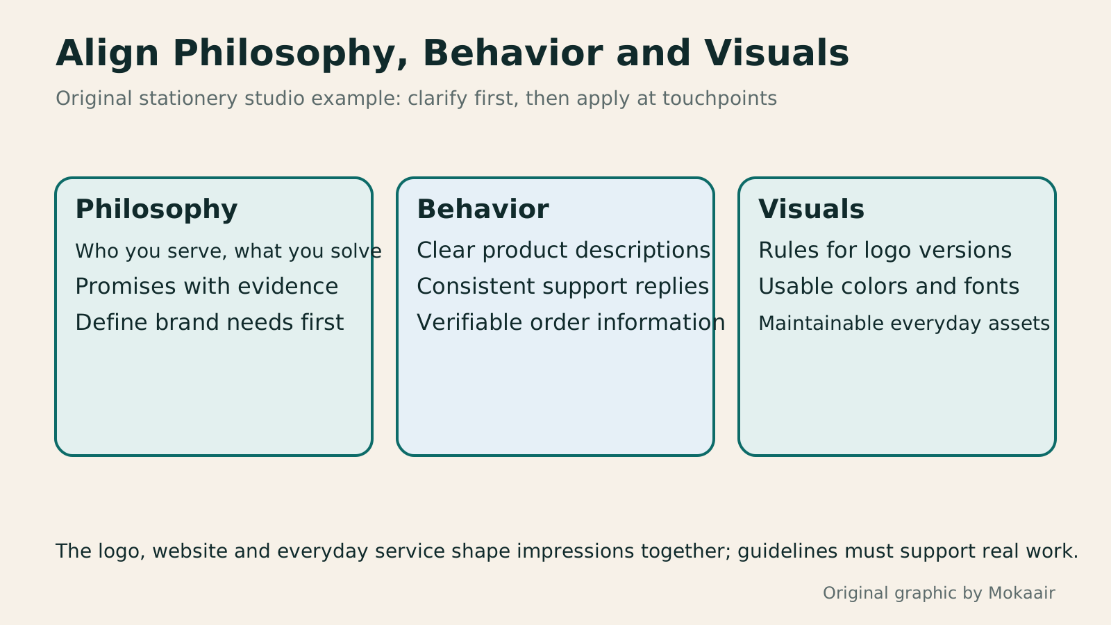
Three cards show how philosophy, behavior and visuals address the studio's brand needs; none uses an institution's identity graphics.
| Identity work | Original stationery studio example | Deliverables |
|---|---|---|
| Philosophy | Help organize daily work | Values, audience and scope |
| Behavior | Clear replies about products and order progress | Service principles and sample wording |
| Logo | Recognizable on the website and in avatars | Versions, clear space and usage conditions |
| Colors and fonts | Consistent reading and interaction | Uses, color codes and typography rules |
| Asset rights | Traceable sources for future production | Licensing and handover records |
| Maintenance | No mixing of old and new versions | Person responsible and update checklist |
Establish website color and readability rulesBuilding a Website Color System: Hue, Lightness, and ReadabilityWebsite colors need more than an attractive palette: text, buttons, and states must stay clear across pages. Using an original home repair course site, this article explains hue, chroma, lightness, color relationships, and semantic roles, then calculates text contrast from actual color codes. Steps, a comparison table, and original diagrams help beginners build maintainable color rules, while treating color psychology as a design hypothesis to test.Read the full article
Organize the handover of web and print outputChoosing Between RGB and CMYK: Screens, Print, and File ExportThe same event artwork can look vivid on a website but different on a printed flyer. Using original community swap market materials, this article explains RGB, CMYK, color profiles, and soft proofing, with web and print export steps, a handoff comparison table, and original diagrams. It helps general users check the purpose and print conditions before choosing a conversion method, avoiding confusion between profile assignment and conversion or delivery after merely renaming a file.Read the full article
Build a consistent, well-founded brand voiceBrand voice and atmosphere marketing: stay consistent while answering real questionsBrand voice and atmosphere are more than a consistent palette or the same emoji in every sentence. Readers should understand how a brand speaks and serves them across different situations. Using an original rain-gear brand, this guide covers voice principles, visual information hierarchy, situational tone and ways to check understanding. Product launches, instructions, delay notices and an original diagram help teams create coherent content without rigidity or sacrificing readability for mood.Read the full article
Found this guide helpful? Share it with someone who needs it
Lifestyle
How to Read the BCG Matrix: Uses and Limits of Product Portfolio Analysis
The BCG matrix maps product portfolios by market growth and relative share; stars, cash cows, question marks and dogs do not establish actual profit. An original home goods store example shows how to define markets, check comparison periods and denominators, understand model assumptions, and allocate resources using costs, turnover and customer needs. Includes a four-category table, practical steps, original diagrams and options when reliable market data is lacking.
Lifestyle
How to Use the Ansoff Matrix: Four Options for Expanding Products and Markets
The Ansoff matrix maps four growth paths using existing or new products and markets: market penetration, market development, product development and diversification. An original canvas goods studio example shows how to define the current business and compare the capabilities and evidence each path needs. A comparison table, steps and original diagrams turn growth ideas into small, testable plans, without treating the model as a success-rate table.
Lifestyle
How to Write Marketing Copy: Clarify Value, Conditions, and Next Steps
Marketing copy should explain who it suits, its value, conditions, and what happens next. Using an original journal-binding workshop example, this article revises information hierarchy, features and benefits, evidence for claims, and action buttons step by step. A before-and-after table and original diagrams show how to retain appeal without overstating promises, and check that prices, limits, images, and links align before publication.
Lifestyle
Customer Journeys and Marketing Funnels: Find Where Readers Drop Off
Customer journeys explain touchpoints and needs; marketing funnels count people at each step using consistent criteria. Using an original bicycle repair booking example, this article explains how to map online and offline contacts, define completion events, calculate step conversion rates, and set up GA4 open or closed funnels. A calculation table, practical steps, and original diagrams help identify improvement hypotheses to test without mistaking data gaps for causes of customer drop-off.
Sources
- Nan Kai University of Technology: Three Dimensions of Its Public Identity StandardsChecked:
- Adobe: Visuals and Tone Covered by Brand GuidelinesChecked:
- Taiwan Intellectual Property Office: Differences Between Trademarks, Company Names and DomainsChecked:
- Taiwan Intellectual Property Office: Text and Graphic Trademark SearchesChecked:
- W3C: How Contrast Requirements Apply to General Text and LogosChecked:
Compiled from the references and verification dates listed above; fares, schedules, product features, and terms can change, so please confirm the latest details on the relevant official website before travelling, booking, or purchasing.