Lifestyle
Brand voice and atmosphere marketing: stay consistent while answering real questions
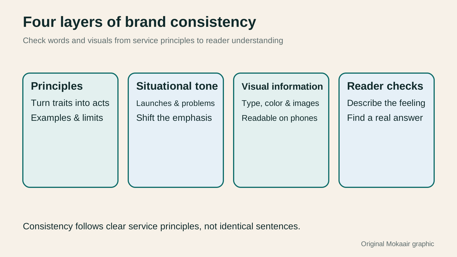
Brand voice and atmosphere are more than a consistent palette or the same emoji in every sentence. Readers should understand how a brand speaks and serves them across different situations. Using an original rain-gear brand, this guide covers voice principles, visual information hierarchy, situational tone and ways to check understanding. Product launches, instructions, delay notices and an original diagram help teams create coherent content without rigidity or sacrificing readability for mood.
About 7 min read
Contents
- 1. Keep brand personality steady; adjust tone to the situation
- 2. Turn abstract feelings into choices the team can discuss
- 3. Let visual style clarify the information hierarchy
- 4. Keep the principle; change the emphasis by situation
- 5. Create a maintainable one-page voice and visual guide
- 6. Check both the feeling and whether people find the answer
A rain-day product page can feel quiet and lived-in, but when a customer asks when an order will ship, clear information matters most. The same brand need not use identical sentences in every setting. A voice and visual approach is maintainable when people recognize its style and can still find the answer they need now.
This guide draws on first-party guidance from Mailchimp, Nielsen Norman Group and W3C consulted on September 14, 2026. Here, atmosphere means the feeling created together by words, visuals and interactions. The rain-gear brand and examples are original; no real brand was studied and no user test was conducted.
Keep brand personality steady; adjust tone to the situation
Mailchimp's content guidance distinguishes the more stable brand voice from tone that changes with a reader's feelings and context. That is a useful starting point: a team can keep clear, considerate principles while using a different pace for a product introduction and a shipping delay. Every message need not be equally cheerful.
An original rain-gear brand seeking a calm, organized everyday feel can define observable writing behaviors: state the purpose first, explain specifications in familiar terms, and make notices easy to find. These are easier to hand over than the phrase ‘premium feel’ alone. Connect each adjective to a few real examples.
Also specify what the brand will not do. Do not blame customers for asking how to use a product, or present an unconfirmed shipping date as a promise. These boundaries come from service principles, not a demand that every writer imitate one person. Consistency should let readers expect reliable information quality.
Turn abstract feelings into choices the team can discuss
Nielsen Norman Group proposes discussing tone through dimensions such as formality, humor, respect and enthusiasm. These are communication tools: they help explain why a passage feels too casual or like a public notice. They are not a scoring formula for brand quality, and no single combination suits every audience.
The example brand might make a new-product introduction friendly and measured while keeping specifications direct and concrete. ‘Make room for an umbrella in your commuting bag’ invites a scene, but must be followed by storage dimensions and conditions of use. If those facts are not verified, ask the product owner to supply them rather than covering the gap with mood-setting copy.
When discussing a draft, write two versions using the same facts, then name the difference. One may lead with an everyday situation; the other may lead with specifications. Readers may understand them differently. Discussing exact wording, information order and suitable pages helps more than saying ‘this does not sound like us.’
Let visual style clarify the information hierarchy
Colors, type and images can create a shared style, but headings, main content, notices and action points must remain distinguishable. The example brand can use self-drawn rain lines and simple color fields to set a scene while keeping dimensions, specifications and service details clear. Do not hide every important word in a decorative hero image.
For ordinary text and images of text, WCAG 2.2 generally requires contrast of at least 4.5:1. Text meeting the large-text definition has a different threshold, and specific exceptions apply. This is a reminder not to select colors solely because they look soft. Prepare palette combinations appropriate for text and background roles, then check the actual rendering.
Text that is large inside an original graphic should not automatically count as large after the graphic shrinks on a phone. Check the size and contrast people actually see, and provide important information as page text too. If a diagram needs explanation, its caption should say what it conveys instead of ending at ‘brand image.’
Keep the principle; change the emphasis by situation
A product introduction may include more context and anticipation, while instructions should lead with actions and conditions. A delay notice should start with the known status and next arrangements. All three can be calm and clear even though their emphasis differs. Brand tone must not prevent support staff from stating the facts a customer needs now.
In the original example, a delay notice saying only ‘let good things find their way to you’ leaves the recipient unsure what happened. Instead, explain the order's current processing status, what is still being checked and how to get the next update. State a specific time only when an arrangement actually exists; do not invent a promise to make the sentence feel complete.
A usage question is no place for a joke implying that the customer is foolish. First identify the step where they became stuck, then provide the relevant instructions or support route. Even a normally playful brand should make help clear and usable when someone has a problem. Adjusting tone to context applies the same service principle across settings; it is not a loss of identity.
Create a maintainable one-page voice and visual guide
A small team may not need a thick brand manual. Start with one page listing the audience, core principles, preferred terms and example sentences for several situations. Add the conditions under which each example applies so the next writer understands why it works. Flag facts that still need product or support confirmation instead of treating an old example as a permanent fact.
For visuals, record suitable typefaces, color roles, image direction and information hierarchy. Do not deliver only color codes: explain which colors work for backgrounds, body text or notices and which reading checks are required. If photographs are added later, record their source and license in the asset log; online images are not free decoration.
Connect the guide to the content workflow and assign an owner and version. For each change, identify whether it corrects service information or adjusts expression; different people may need to approve these. A guide can support consistency, but should not turn every reply into a fixed template that ignores what a customer actually asked.
- Write down the audience and service principles, then turn abstract personality into observable writing choices.
- Create comparable original examples for product launches, instructions and problem notices.
- Define the hierarchy of text, images and notices, and check readability on a phone.
- Ask target readers what they understood and felt; revise the versioned guide from their feedback.
Check both the feeling and whether people find the answer
Ask readers who fit the intended situation to describe the brand in their own words after viewing the content, then answer a practical question, such as where to find packed dimensions or a contact for a delay. Do not tell them first that you hope for a ‘warm’ answer. Let them describe it naturally, then ask which words or visuals produced that impression.
To compare versions, change one category of factor at a time where possible: first tone, for example, then visuals. If the image, price and layout all change and clicks rise, tone alone cannot take the credit. A small observation can reveal a problem, but it cannot establish that all Taiwanese readers share a preference.
Finally, check whether the style reaches product pages, notifications and support replies. A reader who sees beautiful promotion but then meets vague terms or an unusable help route loses that brand experience. Ongoing refinement should make content recognizable and readable across settings, with an actionable next step when one is needed.
| Original situation | Voice and visual emphasis | Information to retain |
|---|---|---|
| New product | Calm context with self-drawn everyday imagery | Purpose, specifications and conditions of use |
| Product instructions | Clear verbs and recognizable steps | Actual procedure and essential cautions |
| Delay notice | Direct status and available help | Known facts, update plan and contact route |
| Support reply | Respect the question and explain the specific difficulty | Relevant answer and follow-up steps |
| Event reminder | Consistent type and clear information hierarchy | Eligibility, time and participation link |
Start by stating the value and conditions clearlyHow to Write Marketing Copy: Clarify Value, Conditions, and Next StepsMarketing copy should explain who it suits, its value, conditions, and what happens next. Using an original journal-binding workshop example, this article revises information hierarchy, features and benefits, evidence for claims, and action buttons step by step. A before-and-after table and original diagrams show how to retain appeal without overstating promises, and check that prices, limits, images, and links align before publication.Read the full article
Put the brand guide in the content calendarPlanning a Content Marketing Calendar Around Reader Questions and UpdatesA content marketing calendar does more than assign publication dates to headlines. It also schedules reader questions, asset production, fact-checking and ownership of updates. Using a fictional fabric shop, this guide turns customer-service questions into an idea bank and plans articles, diagrams and short posts together. A four-week schedule, production steps and an original diagram show how to allow time for review and maintenance, then test whether each piece helps readers complete a task.Read the full article
Self-hosting WordPress fonts: files, licenses, and loading speedSelf-hosting WordPress fonts: files, licenses, and loading speedServing fonts from your own WordPress site gives you control over their source and delivery, but you still need to check web-use rights, character coverage, and file size. This guide explains how to use the Font Library or CSS, what to consider for Traditional Chinese subsets, and how to check layout and speed before and after the change so site owners can balance brand appearance, readability, and maintenance.Read the full article
Found this guide helpful? Share it with someone who needs it
Lifestyle
How to Read the BCG Matrix: Uses and Limits of Product Portfolio Analysis
The BCG matrix maps product portfolios by market growth and relative share; stars, cash cows, question marks and dogs do not establish actual profit. An original home goods store example shows how to define markets, check comparison periods and denominators, understand model assumptions, and allocate resources using costs, turnover and customer needs. Includes a four-category table, practical steps, original diagrams and options when reliable market data is lacking.
Lifestyle
How to Use the Ansoff Matrix: Four Options for Expanding Products and Markets
The Ansoff matrix maps four growth paths using existing or new products and markets: market penetration, market development, product development and diversification. An original canvas goods studio example shows how to define the current business and compare the capabilities and evidence each path needs. A comparison table, steps and original diagrams turn growth ideas into small, testable plans, without treating the model as a success-rate table.
Lifestyle
How to Write Marketing Copy: Clarify Value, Conditions, and Next Steps
Marketing copy should explain who it suits, its value, conditions, and what happens next. Using an original journal-binding workshop example, this article revises information hierarchy, features and benefits, evidence for claims, and action buttons step by step. A before-and-after table and original diagrams show how to retain appeal without overstating promises, and check that prices, limits, images, and links align before publication.
Lifestyle
Customer Journeys and Marketing Funnels: Find Where Readers Drop Off
Customer journeys explain touchpoints and needs; marketing funnels count people at each step using consistent criteria. Using an original bicycle repair booking example, this article explains how to map online and offline contacts, define completion events, calculate step conversion rates, and set up GA4 open or closed funnels. A calculation table, practical steps, and original diagrams help identify improvement hypotheses to test without mistaking data gaps for causes of customer drop-off.
Articles that cite this one
Sources
- Mailchimp: brand voice and situational toneChecked:
- Nielsen Norman Group: four dimensions of tone of voiceChecked:
- W3C: WCAG 2.2 guidance on minimum text contrastChecked:
Compiled from the references and verification dates listed above; fares, schedules, product features, and terms can change, so please confirm the latest details on the relevant official website before travelling, booking, or purchasing.