Lifestyle
UI and UX for Beginners: Interfaces, Tasks and User Research
UI and UX often share a job title, but learners need to distinguish the problems addressed by interfaces, tasks and research. Using an original clothing alterations shop pickup example, this article explains visual and interaction design, the full service experience and user research, with beginner exercises, an outcomes comparison table and original diagrams. It helps beginners in Taiwan build a learning path to explain design decisions and check courses for practice and feedback.
About 8 min read
Contents
- 1. UI focuses on how people understand and operate an interface
- 2. UX looks at the overall experience of using products and services
- 3. Research helps teams understand needs; design turns understanding into action
- 4. Use small exercises to build learning outcomes that can be assessed
- 5. Plan your learning sequence and practice communicating with developers
- 6. Assess progress through your ability to explain and revise
When you want to learn UI/UX, opening a course list and seeing interface design, research interviews, prototypes, design systems and programming can make you think you have to learn every tool at once. A more useful starting point is to understand what question each kind of work answers, then use a small exercise to practice connecting them.
This article uses an original clothing alterations shop pickup service example and draws on primary design and competency sources consulted on 2026-9-14. The scenario, exercise plan and examples were independently designed, without research at an actual shop or employment outcomes. The role references cited here also do not mean that every company in Taiwan divides responsibilities under the same job titles.
UI focuses on how people understand and operate an interface
UI stands for user interface. For a website, it includes the text, colors, buttons, fields and interactive responses on the screen, rather than simply making colors and fonts look attractive. The interface needs to communicate whether a click succeeded and help users understand why a field has an error.
A clothing alterations shop's pickup page offers practice in presenting an order number, expected completion time and pickup instructions. If the time has not been confirmed, design a pending-confirmation state. If the order number cannot be found, provide a next step as well. Drawing only one screen with all the information available is not enough to explain how the interface handles real usage situations.
When learning UI, start by practicing text hierarchy, spacing, alignment and states, then gradually add reusable components and layouts for different screens. Each time, ask yourself: What does this visual difference communicate? For example, does prominent text mean something is unfinished, or does it indicate an available action? If the rules are inconsistent, readers have to guess again.
UX looks at the overall experience of using products and services
UX stands for user experience and encompasses people's overall experience of interacting with products, services and organizations. Norman and Nielsen's definition extends beyond a single screen. The interface is one part of that experience, and ease of use does not guarantee satisfaction with the entire service. When learning, place the screen back in the user's context.
Suppose a customer understands the pickup page but only learns upon arriving at the shop that they need a receipt, which they left at home. The problem may lie in how the reminder content connects with the in-store process. Enlarging a button may not solve it. You need to establish when customers learn the rules, how staff verify orders and what acceptable alternatives exist.
This does not mean every beginner has to redesign an entire shop. You can first define the exercise as handling only information confirmation before pickup, and list the shop's operational conditions that affect it. A clear scope lets you distinguish the interface you can change, service rules that require collaborative confirmation and ideas that are not yet supported by data.
Research helps teams understand needs; design turns understanding into action
User research starts by clarifying what you want to know, then selecting suitable observation, interview or testing methods. The UK government's user research competency description positions research as helping teams understand service users in depth and influencing content, interaction and service decisions. This article adopts that approach to the work without applying its civil service grades.
For the pickup exercise, start by listing questions: When do customers usually confirm the completion time? What do they do if they cannot find their receipt? Then separate known shop rules, your own assumptions and matters you need to ask about. If you have not yet worked with real users, keep these as research questions rather than creating a seemingly precise persona to serve as evidence.
Interaction design requires thinking through the path to completing a task and the response at each step. Research and design may be handled by different people or overlap in a small team. The work still requires participation from content specialists, developers and service staff. Explaining the basis for your judgments and who needs to collaborate is more practical than dividing all the work by job title.
Use small exercises to build learning outcomes that can be assessed
First choose a clear task, such as checking whether clothes are ready for pickup, and write down its starting and completion conditions. Next, list states such as confirmed information, processing and order not found, sketch a simple flow, then create screens that communicate the order of the content. Keeping the scope small leaves time to examine failure cases and return paths.
For each exercise, keep three records: the problem you want to solve, your current design and the reasons for choosing this approach. If your only reason is that it looks better, ask how the visual change helps people read or interact. If a decision still needs validation, mark it as an assumption, and explain what you need to observe before deciding whether to revise it.
Once you can explain the basic flow clearly, add colors, components and responsive screens, then prepare handoff notes. You can complete the first version with pen and paper or a design tool you already know; you do not need to buy every course and plugin first. The exercise focuses on developing a proposal that people can discuss, while tool proficiency grows gradually through repeated use.
- Choose a single user task and write down its context, starting conditions and completion conditions.
- Record known information, personal assumptions and questions for research separately.
- Map the main flow and exception states, then arrange text, buttons and interactive responses.
- Revise after receiving specific feedback, keeping the reasons for changes and any limitations that remain unverified.
Plan your learning sequence and practice communicating with developers
Beginners can first build an understanding of reading and information hierarchy, task flows and research fundamentals, then practice interactive prototypes and components. This is the exercise sequence suggested by this article, rather than a syllabus everyone must follow. Those with graphic design experience can strengthen their handling of interaction states; those with a programming background can practice understanding needs and expressing ideas in writing.
Understanding the basics of HTML, CSS, browsers and accessibility helps you discuss design constraints with developers. MDN's frontend learning materials provide a public starting point for this area, but studying a few chapters does not immediately give you complete development skills. The depth of your learning should fit your work goals and how you collaborate.
When evaluating a course, look beyond tool names to see whether it offers clear assignments, feedback methods, research ethics and an explanation of its actual scope. Demands for guaranteed hiring, claims that everyone can successfully change careers within a fixed number of days, or large collections of templates without feedback are unsuitable as evidence of ability. Before choosing a course, identify which kind of learning outcome you most need to strengthen.
Assess progress through your ability to explain and revise
When showing your work to someone, ask them to explain the task as they understand it, the next step they expect and anything that confuses them. If you conduct formal user research, explain its purpose, how people will participate, how data will be used and how they can withdraw in advance, then collect data within the agreed scope. Classroom exercises should also avoid putting personal stories into a portfolio without consent to make them public.
During review, distinguish opinions from observations. A friend saying the colors look bad expresses a preference, while a participant being unable to find the pickup status is an interaction problem you can investigate. Both can be recorded, but they require different analysis methods. Do not generalize a small amount of feedback into all customers' preferences, or invent test results to make a project appear complete.
A beginner project that explains the context, flow, interface states, reasons for decisions and questions awaiting validation already provides a basis for further discussion. You can then explore visual design, research or interaction in greater depth according to your interests and apply what you learn to the next exercise. When assessing your progress, checking whether you can identify problems more clearly and revise your work is more useful than collecting tool certificates.
Read the full description
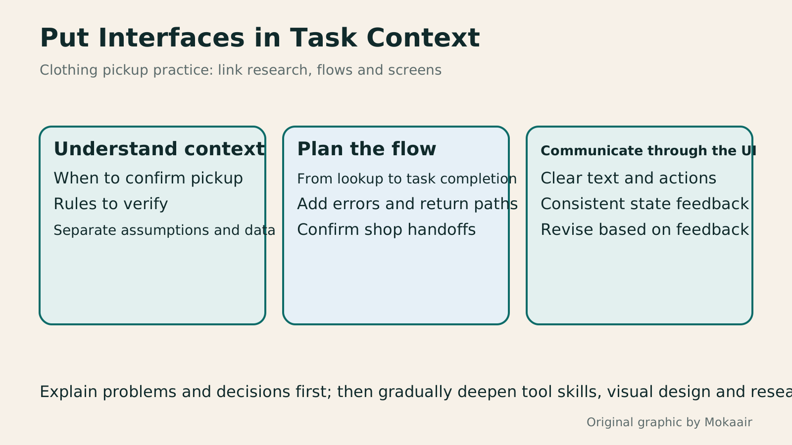
Three cards show understanding context, planning flows and communicating through an interface, illustrating how beginners can connect UI and UX through a concrete task.
| Learning area | Pickup service exercise | Assessable outcomes |
|---|---|---|
| Interface design | Arrange states, text and actions | Screen hierarchy and component states |
| Interaction design | Handle lookups, returns and errors | Task flows and interaction explanations |
| User research | Understand the context for confirming timing | Research questions and data limitations |
| Service experience | Connect shop visits with verification rules | Touchpoints and collaboration needs |
| Developer communication | Explain layouts and data conditions | Understandable handoff notes |
Arrange information hierarchy and the reading order of a layoutInformation Hierarchy in Web Layouts: Whitespace, Alignment, and Reading OrderA busy page can leave readers unsure where to look first, usually calling for a revised information hierarchy. Using an original used-book swap event page, this article adjusts the main task, heading levels, grid alignment, whitespace, and action buttons step by step, and explains visual versus programmatic reading order. A comparison table, practical steps, and original diagrams help readers turn tidy layouts into pages they can read, understand, and use.Read the full article
Turn learning outcomes into a credible project case studyHow to Organize a Portfolio Website: Show Problems and Outcomes Through Case StudiesA portfolio site should show what you did, your role, and why you made those design choices. Using an original rainy-day commute information page exercise, this article covers project selection, case structure, outcome evidence, platforms, and contact details, plus public, link-only, and password-protected access. Steps, a comparison table, and original diagrams help designers, researchers, and freelancers turn work into readable, verifiable case studies suited to sharing.Read the full article
Understand website collaboration from requirements to acceptanceHow to Start a Web Design Project: Requirements, Content, and Acceptance Testing in OrderBuilding your first website often stalls over unclear requirements, content, and acceptance criteria, rather than colors. Using an original neighborhood repair studio example, this guide covers user interviews, content preparation, prototyping, development, and handover, with deliverables for each stage. Steps, a comparison table, learning resources, and original diagrams help readers building or commissioning a site turn “Is it finished?” into tasks they can verify.Read the full article
Found this guide helpful? Share it with someone who needs it
Lifestyle
www, Subdomains, and Subdirectories: Choosing a Website URL Structure
Whether to use www or put a blog at blog.example.com or example.com/blog/ depends on platform support and maintenance. This article explains hostnames and paths, then compares content roles, DNS settings, HTTPS certificates, and URL consistency for subdomains and subdirectories. An original decision table and launch checklist help small websites in Taiwan build URL structures that are easy to use, manage, and hand over.
Lifestyle
Before Hiring a Web Design Agency: The Brief, Quotes and Deliverables Checklist
Before hiring a web design agency, define your site's audience, key actions and deliverables so you can compare quotes. Using a small studio as an example, this guide covers page and template counts, content duties, feature specs, mobile and accessibility checks, account and source-file handover, and post-launch maintenance terms. An editable requirements checklist helps reduce extra costs and communication gaps; no agency recommendations are included.
Lifestyle
How to Start a Web Design Project: Requirements, Content, and Acceptance Testing in Order
Building your first website often stalls over unclear requirements, content, and acceptance criteria, rather than colors. Using an original neighborhood repair studio example, this guide covers user interviews, content preparation, prototyping, development, and handover, with deliverables for each stage. Steps, a comparison table, learning resources, and original diagrams help readers building or commissioning a site turn “Is it finished?” into tasks they can verify.
Lifestyle
Website Caching and CDNs: Which Layer to Clear When Updates Do Not Appear
A website may be updated while phones still show old content because caches remain in different places. Using a Taiwan studio's business-hours update, this article explains browser, WordPress/hosting and CDN roles, cache responses, expiry times and targeted purging. An ordered procedure, comparison table and original diagram help site managers trace old versions while keeping account and shopping workflows correct.
Articles that cite this one
Sources
- NN/g: The Definition of User ExperienceChecked:
- Figma: The Scope and Overlap of UI and UXChecked:
- UK Government: Interaction Design CompetenciesChecked:
- UK Government: User Research CompetenciesChecked:
- MDN: Core Frontend Learning CompetenciesChecked:
- UK Government: Informed Consent for Research ParticipantsChecked:
Compiled from the references and verification dates listed above; fares, schedules, product features, and terms can change, so please confirm the latest details on the relevant official website before travelling, booking, or purchasing.