Lifestyle
Using AI for UI Design: From Requirements in Prompts to Verifiable Interfaces
AI-assisted UI design needs more than detailed prompts: link requirements, assumptions and acceptance checks. An original laundry status lookup page shows what context to supply, screen states, edit scope and data boundaries. A comparison table, steps and original diagram explain checks of content, keyboard use and user tasks, helping everyday users turn generated drafts into interfaces they can discuss and test, without treating simulated responses as real research.
About 8 min read
Contents
- 1. Start by Writing the Usage Scenario and Completion Criteria
- 2. Build a Prompt into a Design Brief You Can Check
- 3. Record Assumptions Instead of Approving Generated Results on Instinct
- 4. Address One Identifiable Problem at a Time
- 5. Move from Reviewing Screens to Observing Actual Use
- 6. Document Decision Rationale and Verification Limits at Handoff
Ask AIWhat Is Artificial Intelligence?AI covers many technologies and uses; it is not synonymous with chatbots and need not generate text. Starting with the OECD system definition, this article uses photo classification and community resource recommendations to link inputs, inference, outputs and human goals, and explains AI's relationship to machine learning, deep learning and generative AI. Learn to ask concrete questions about what an AI feature does and distinguish capability, autonomy and trustworthiness.Read the full article to draw a simple status lookup page, and you may get complete input fields, a progress bar and an attractive illustration. But it may not know that the shop offers no delivery service or where the order number is printed on the receipt. A prompt's first job is to provide the right working context, rather than pile up words describing style. This applies to any UI AI or design AI.
The following demonstration uses an original laundry status lookup page, assuming customers want to check whether their clothes are ready for pickup. This is a hypothetical project with no real customer data or test results. The method draws on design and user research documentation reviewed on 2026-9-14; check features, permissions and pricing separately for the product you use.
Start by Writing the Usage Scenario and Completion Criteria
Before opening a generation tool, briefly describe who is doing what and under what circumstances. For example: a customer holding a receipt wants to enter its number on their phone to find out whether they can collect their clothes from the shop. Completion means understanding the current status, opening hours and next step, rather than remaining on a homepage with a branded look.
Keep confirmed facts separate from items awaiting confirmation. The shop name and public phone number can come from information supplied by the shop; first ask the person in charge which fields a lookup requires, how often information is updated and how expired orders are handled. When answers are unavailable, ask AI to leave markers, rather than invent customer service promises or pickup rules.
Figma's documentation on prompts and design context emphasizes that specific background, objectives and constraints help tools understand a task. But putting information in a prompt does not make the answer correct or guarantee that specified components will be used. A prompt is simply an input to the work; afterward, check each item against the requirements and actual structure.
Build a Prompt into a Design Brief You Can Check
An original prompt could read: Create a draft mobile status lookup page for a laundry shop; customers get their number from a receipt and need to see an In progress or Ready for pickup status after a successful lookup. Reuse the specified button style, use Traditional Chinese, and mark unknown shop information with To be confirmed text. First list any information that requires follow-up questions, then provide the screen layout.
Next, specify the required states: no input yet, invalid format, no results, loading, success and service temporarily unavailable. For each state, write down what readers need to understand and what they can do. Do not merely ask for error messages; you may get red text that looks complete but offers no way to fix the problem.
Finally, specify the scope of changes and deliverables. For example, create only the lookup and results pages, without adding membership, payment or marketing pop-ups; provide screens, a component mapping and unresolved questions. If the tool produces only images, you cannot directly verify layers or keyboard behavior. If it produces code, you must also examine actual data access and error handling separately.
Record Assumptions Instead of Approving Generated Results on Instinct
After receiving a draft, create a simple table recording design decisions, their basis, risks and verification methods. For example: assuming customers can find the number on their receipt, you keep just one input field. Verify this by asking potential customers to look at a receipt and complete a lookup, rather than asking AI whether the design is intuitive.
Another assumption is that customers understand In progress to mean their clothes are not yet available for pickup. You can observe what participants intend to do after seeing the result and whether they would still call to confirm. If most still do not understand, improve the status explanation and next step first, rather than rushing to change colors or add animation. These are methods yet to be carried out; no survey data is presented here.
Asking AI to role-play a customer can help identify potentially overlooked questions, but model responses are not evidence of actual user behavior. Keep the resulting questions labeled as assumptions and check them against shop information, existing customer service records or user research conducted with consent. Do not present simulated interviews as proof that customers already agree.
Address One Identifiable Problem at a Time
If the initial result squeezes multiple columns into a narrow screen, a follow-up prompt could specify: Keep the original fields and text, and arrange the results in this order: status, pickup instructions and shop information. Change only the layout, not the lookup criteria. This lets you compare whether the revision solves the problem and watch for the tool inadvertently deleting necessary content.
Keep the previous version before each change, and record the reason and affected scope. Describe the actual problem clearly: a long shop name wraps and covers a button, for example. This makes effectiveness easier to judge than asking for more polish. If the tool repeatedly reworks the same section, you can fix it manually and specify the result to retain as the baseline for the next round.
Before feeding content into a tool, remove real orders, phone numbers and screenshots that could identify customers, and use fictional data instead. Check the terms governing uploaded content, collaborator visibility and licenses for available components. Disabling use for model training does not mean the service will not process your input, nor does it authorize you to use material you had no right to provide.
- Write down customer tasks, completion criteria, known facts and rules awaiting confirmation.
- Provide screen states, component constraints and delivery requirements, keeping markers for unknown information.
- Compare each part of the draft against the requirements, and turn design decisions into testable assumptions.
- Arrange interaction checks and user tasks, revise based on observations, and keep handoff records.
Move from Reviewing Screens to Observing Actual Use
Start with basic checks: does the heading explain the purpose, do fields have identifiable labels, can errors be matched to fields, is the text clear, and does it remain readable when enlarged? For a working version, also try moving focus with the keyboard to confirm that focus is visible, follows a logical order and never becomes trapped. An image prototype alone cannot demonstrate these behaviors.
W3C's Easy Checks provides preliminary accessibility checks, not proof of full standards compliance. Do not claim that a website has fully passed simply because AI says it is accessible or an automated tool reports no warnings. Arrange more comprehensive checks according to the product's needs, and record unverified items and who is responsible for them.
GOV.UK's usability testing guidance recommends recruiting actual or potential users, giving them neutral tasks and observing their actions. For this project, you could ask participants to check whether their clothes are ready for pickup, without directly telling them to click a particular button. Explain the research purpose beforehand and obtain consent. Record confusion, errors and requests for explanation, and avoid counting completion with assistance as independent success.
Document Decision Rationale and Verification Limits at Handoff
Finally, compile the requirements version, selected screens, required states, data fields and unresolved questions. For each important change, explain whether it is based on shop confirmation, manual checks or user observations. If you have only conducted an internal walkthrough, label it honestly as an internal walkthrough; avoid unsupported conclusions such as significant improvement in actual testing.
Frontend handoff also needs to distinguish presentation from business rules. The no-results message and search-again button can be described in the interface specification, but order access permissions, lookup frequency and data retention require separate design by the implementation team. Generated code that displays a demo screen is not proof that it connects to the correct, protected service.
These requirements and verification records remain useful as tools evolve. Keep editable files, necessary outputs and asset sources so that whoever takes over knows what can change and what still needs confirmation. The value of AI prompts lies in whether the team can explain and maintain its chosen interface, rather than how long the prompts are.
Read the full description
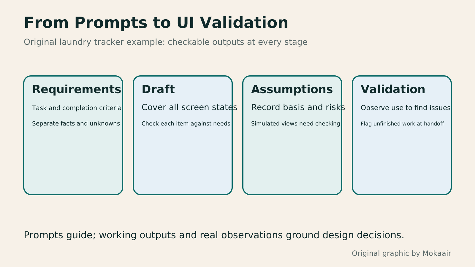
Four cards connect requirements input, generated drafts, design assumptions and interaction evidence, reminding readers to retain unresolved questions and verification limits.
| Prompt Content | Original Lookup Page Example | How to Check the Result |
|---|---|---|
| User task | Check whether clothes are ready for pickup | Can explain the status and next step |
| Knowns and unknowns | Shop phone number known; update frequency needs asking | No invented promises |
| Screen states | Loading, no results and service unavailable | Clear explanations and follow-up actions |
| Scope of changes | Only rearrange the lookup results | No fields or criteria have been deleted |
| Design assumption | Customers can find the number on their receipt | Potential users actually try the task |
| Delivery boundaries | Editable draft and list of items awaiting confirmation | Do not equate going live with completed acceptance |
Check Figma AI Features and Data Permissions
Choose How to Validate Wireframes and PrototypesHow to Use Wireframes and Prototypes: Validate Flows Before Refining VisualsWireframes, visual mockups, and interactive prototypes serve different purposes. What matters is the question you need to validate now. An original plant care home visit booking scenario shows how to choose fidelity, cover flows and exception states, write tasks without hinting at answers, and turn test observations into change records. Steps, a comparison table, and original diagrams help design beginners and small teams identify usability difficulties before full development.Read the full article
Understand the Division of Work Between UI and UXUI and UX for Beginners: Interfaces, Tasks and User ResearchUI and UX often share a job title, but learners need to distinguish the problems addressed by interfaces, tasks and research. Using an original clothing alterations shop pickup example, this article explains visual and interaction design, the full service experience and user research, with beginner exercises, an outcomes comparison table and original diagrams. It helps beginners in Taiwan build a learning path to explain design decisions and check courses for practice and feedback.Read the full article
Found this guide helpful? Share it with someone who needs it
Lifestyle
Signal Blocks Screenshots by Default on Android and iOS 27 to Stop AI Agents Like Siri and Gemini From Reading Your Screen
The Verge reports that Signal is restricting screenshots on Android and iOS 27 to keep OS-level AI agents from reading message content. Users can turn screenshots back on in settings, but Signal warns this weakens its privacy protections.
Lifestyle
Claude Code 2.1.329: Code Mode Works With Telemetry, /tasks Lists Scheduled Tasks, macOS Computer Use Gets Stricter Safety Rules
Anthropic's changelog lists Claude Code 2.1.329, covering Code Mode behavior changes, new diagnostics in /tasks and /mcp, /code-review changes, and new safety rules for macOS computer use.
Lifestyle
Kimi Code CLI v2.7.0 Adds a Native Amazon Bedrock Provider: Use Your AWS Credentials Instead of a Separate API Key
AWS says Moonshot AI added a native bedrock provider in Kimi Code CLI v2.7.0, letting you call Amazon Bedrock models with the AWS credential chain (including named profiles and SSO) without managing separate Bedrock API keys.
Lifestyle
AWS Rounds Up 13 SageMaker Inference Features: Managed NVIDIA Dynamo on HyperPod, MIG GPU Partitioning, Cross-Region Routing
On November 20, AWS published part 2 of its 2026 SageMaker Inference review, covering 13 post-launch operations features across recommendations, GPU partitioning, large-model serving, cross-Region routing and monitoring.
Sources
- Figma: AI design promptsChecked:
- Figma: Design context for AIChecked:
- GOV.UK: Using moderated usability testingChecked:
- W3C WAI: Easy ChecksChecked:
Compiled from the references and verification dates listed above; fares, schedules, product features, and terms can change, so please confirm the latest details on the relevant official website before travelling, booking, or purchasing.