Lifestyle
WordPress sidebars and widgets: arranging information and persistent blocks
WordPress sidebars can hold search, an author profile and related content, but first ask whether they help readers. This guide distinguishes classic widgets, the block-based widgets editor and block themes. It covers adding, ordering, temporarily removing and checking content, and compares normal flow, sticky and fixed positioning. Check desktop, mobile and enlarged text so information blocks do not cover the article or forms and readers can follow a clear order when the site offers more routes.
About 7 min read
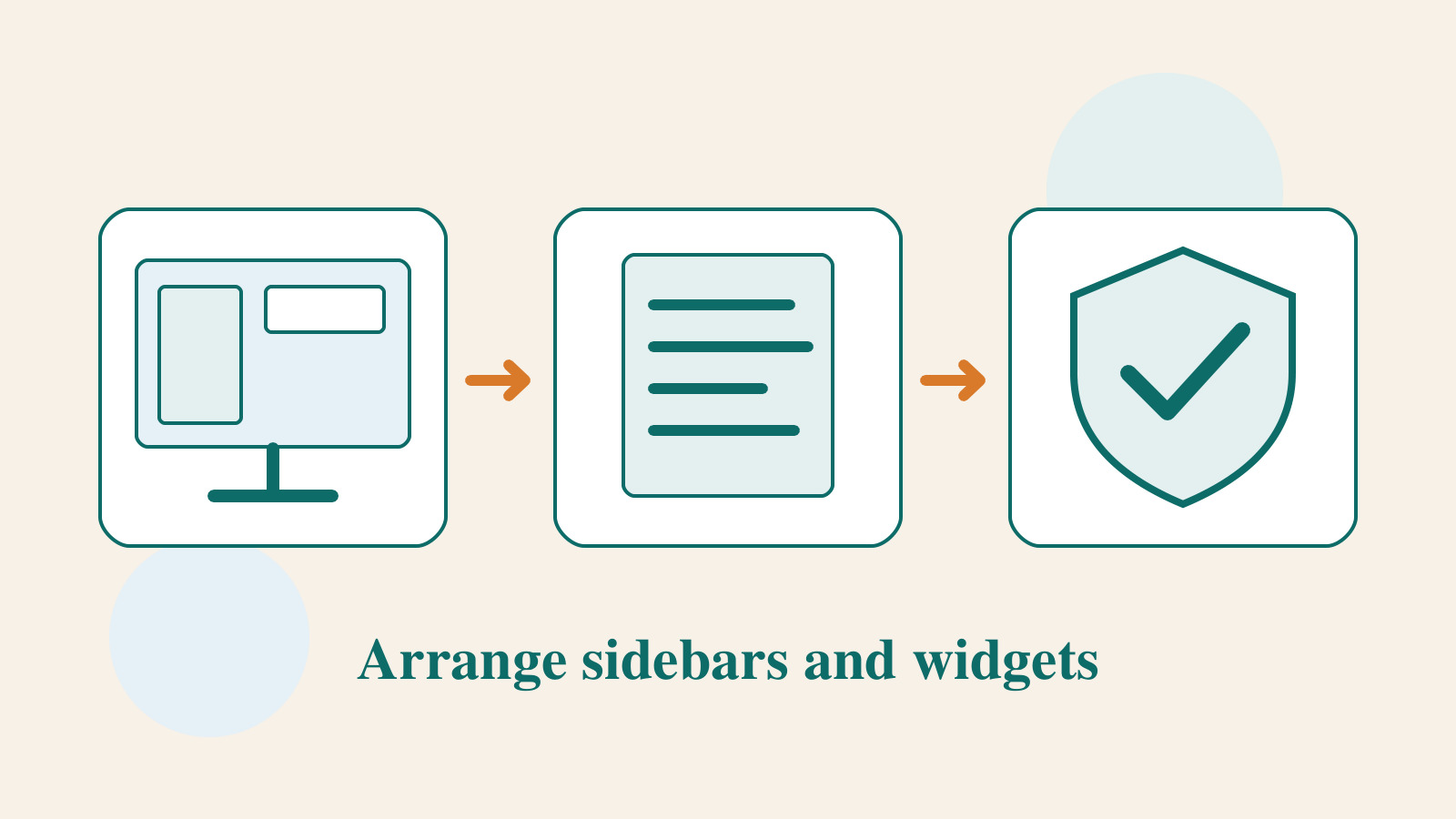
An empty sidebar does not have to be filled. While someone reads an article, search, a contents list or related content may help, but a long advertisement, tag cloud or set of tracking buttons can also distract them. State the purpose of each block before deciding where to place it. That uses layout space for information readers actually need.
The example below is a fictional home-organization blog arranging an author profile, post categories and related reading. The instructions draw on WordPress widget documentation and MDN's positioning guidance; no specific theme or plugin was tested. The available controls and actual layout depend on the active theme, so first check its design if you cannot find a sidebar.
Check how the theme manages this area
A classic theme may provide a sidebar, footer or other widget areas. In a supported classic theme, the block-based widgets editor manages those areas using blocks. It is not the same feature as the Site Editor in a block theme; seeing a block interface does not make the two interchangeable.
With a block theme, side information may instead be built from columns or groups in a template and must be edited in the corresponding template or shared part. With a classic theme, first check Appearance > Widgets and the theme's instructions. A particular page template may intentionally have no sidebar; this does not necessarily mean a setting was lost or that you should immediately install a plugin to restore it.
List the layout used by the home page, article pages, search results and ordinary pages before deciding where to edit. A home-organization article may benefit from related reading, while a contact page may work better with a simple form. Do not assume the same sidebar must appear everywhere. Arrange it around the task the reader is trying to complete.
Keep only information with a clear purpose
Write one reason for each proposed block. Search might help readers find a particular storage problem; an author profile identifies who prepared the content; related posts can continue work on the same room. If the only reason is that another site has a block, leave it out for now and add it when a real need emerges.
Order the blocks for the reading context. A contents list can help with a long article; an author biography need not fill the entire screen; and a category list need not expand every level. Longer text takes more space when a phone turns the page into one column. Start with a few important items, then observe whether readers can take the next step.
Do not put essential information only in the sidebar. State restrictions, steps and important warnings where they belong in the article body. If the mobile layout moves the sidebar below the article, readers may act on the instructions before ever seeing it. An essential condition should not be discoverable only in one screen arrangement.
A basic process for adding and adjusting widgets
Open the block-based widgets editor through Appearance > Widgets, choose the area to change, add blocks and reorder or move them to another area. Existing third-party widgets not converted to blocks may be managed through the Legacy Widget block. Available features still depend on the theme and plugins; do not assume every block from the post editor works here.
If your site uses the classic widgets screen, add, order and configure widgets in the areas provided by the theme. Items you do not currently need but whose settings you want to keep can go to Inactive Widgets instead of being deleted outright. Before changing interfaces, save important text, URLs and settings so you can recover the original content.
Change one area at a time, save, then check the public page. If you place categories below the author profile, confirm that the article page really uses the sidebar you edited and check for caching. Do not add the same item to several areas just because a change is not visible; multiple copies may appear later.
- Identify the theme type, target template and widget area, and save the current settings.
- Add content that serves a real need; set its heading, links and order first.
- After saving, inspect the corresponding public page for duplicates or omissions.
- Test phones, enlarged text and keyboard use before deciding whether to add sticky behavior.
Normal flow, sticky and fixed positioning differ
An ordinary block scrolls with the page. A sticky element usually stays near a specified position after reaching it, within the bounds of its containing block. A fixed element generally remains positioned relative to the viewport. MDN explains these distinctions, but parent settings and layout structure also affect the result. Changing one label does not guarantee identical behavior on a real page.
A short contents list beside a long article may suit sticky positioning; a sidebar taller than the screen can make its lower content hard to reach. A fixed subscription prompt can cover content when it overlaps a header, Cookie notice or chat button. First validate the reading experience with normal flow, then decide whether persistent positioning improves it.
If the theme offers a sticky option, check the devices it applies to, top spacing and stopping point. If extra CSS or a plugin is required, have someone familiar with the layout implement it in a test environment and record where it was changed and how to disable it. Avoid enabling several fixed-sidebar tools at once; their position calculations and scroll behavior may conflict.
Mobile checks should include real interaction obstacles
Narrow the screen and check whether the sidebar moves below the article, is hidden or remains fixed. Inspect article width and reading order. If a function appears only in a desktop sidebar, mobile readers still need an equivalent route, such as search near navigation or the post list. Simply hiding the entire area is not a complete mobile design.
Open the on-screen keyboard for a form and see whether a fixed element covers the input or Submit button. When opening a mobile menu, ensure its Close button still works. Landscape orientation, enlarged text and short screens can reveal problems that normal views miss. The check should include finishing the action, not merely taking a home-page screenshot.
Move keyboard focus in order to confirm sidebar links are reachable, focus is visible and no fixed block covers it. If a block moves or expands automatically, verify that it does not abruptly change the reading position. Ads and third-party embeds may change height after loading, so wait for full loading before testing rather than assessing an empty placeholder.
Review regularly and keep a recovery path
As the site gains articles, popular posts, categories and author information in the sidebar also need updating. Check for expired links, discontinued services and purposeless blocks regularly, and record why an item is removed. If information still matters but sits in the wrong place, move it into the article or footer rather than treating retention and deletion as the only choices.
Before changing themes, save widget settings and screenshots and identify the corresponding areas in the new theme. Their arrangement may differ. After switching, check each page and rearrange information if needed. Success means readers can read and find their next step, not that every old box has been forced back into the same spot.
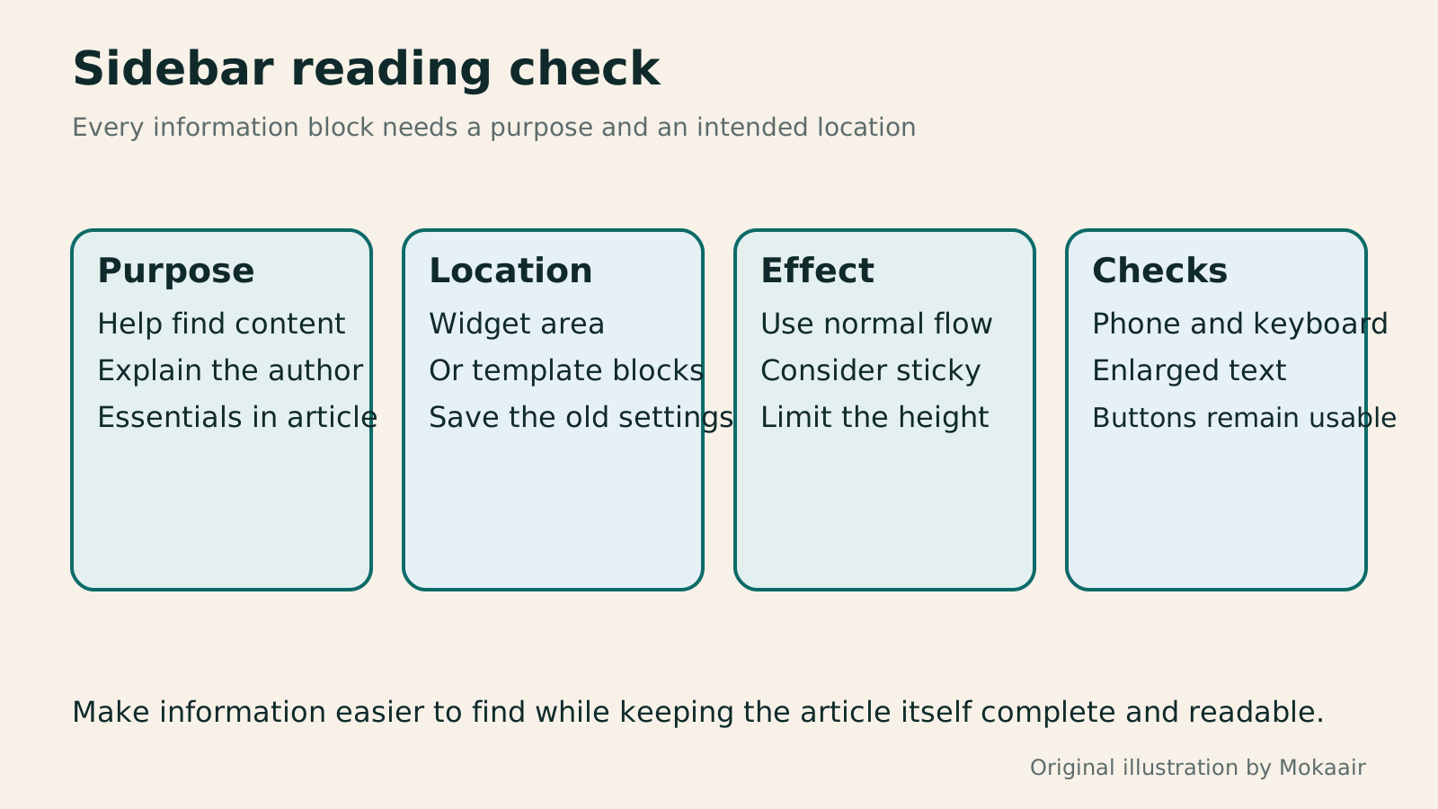
Read the full description
Original four-stage diagram for planning a sidebar by purpose, editing location, positioning effect and checks across devices.
| Method | Suitable use | What to check |
|---|---|---|
| Normal flow | Author profile, categories, related content | Order and content length |
| Sticky | A suitably short contents list or prompt | Container edge and screen height |
| Fixed | A short function that must stay visible | Never cover the main action |
| Move on mobile | Put the sidebar after the article or offer another route | The function remains findable |
| Remove temporarily | Observe whether it is still needed | Keep settings and a recovery method |
Organizing categories, tags and menusWordPress categories, tags and menus: help readers find the next articleCategories, tags and navigation menus organize posts, connect details and provide entry points in different ways. Using a fictional home-cooking site, this guide explains naming and creating categories and tags, setting up navigation in block or classic themes, and checking mobile and keyboard use. It also covers what URLs and mappings to preserve when renaming, changing a slug, merging or deleting, so a growing site remains easy to explore without listing every post in an oversized menu.Read the full article
Dividing work in WordPress adminUsing WordPress admin: dividing content, design and administrator dutiesTaking over a WordPress site? Learn daily tasks: posts, pages, images, design and settings that need an administrator. This guide maps common menus and default roles, with steps to record changes, preview, publish and report faults so small teams can divide work clearly. Interfaces vary by theme, plugin and permissions; check the environment when a feature is missing instead of raising everyone's access.Read the full article
Lifestyle
After a WordPress Move: Check Search Traffic, the Old Host, and Renewals
A completed WordPress move still needs checks that the new host is stable, search entry points work, backups can be used, and old services can safely stop. This guide provides a cutover observation checklist, a way to interpret search traffic, an inventory of old-host dependencies, and renewal closeout steps. Individual site owners and studios can retain the information needed for rollback without confusing temporary fluctuations, ending renewal, and immediately deleting a site.
Lifestyle
Move WordPress to a New Host Without Changing the Domain: Migration, Testing, and DNS Cutover
When WordPress moves to a new host, its URLs can stay the same, but files, the database, certificates, and external services still need a handoff. This guide covers preparation of the new host, restricted previews, the final data sync, and DNS cutover in order. A verification table and rollback criteria help individual site owners and studios keep their domain while moving hosts, without canceling the old service before recovery options are secure.
Lifestyle
Changing a WordPress Domain: Check Redirects, Search Signals, and Email
Changing a WordPress domain means handling internal URLs, redirects from old links, search signals, and email together. Starting with a URL mapping, this guide explains how to preview database replacements, check permanent redirects, test sending and receiving on the new domain, and monitor the change after launch. It helps personal brands and studios plan a name change without assuming that editing the WordPress site address completes the move.
Lifestyle
Moving from WordPress.com to Self-Hosted WordPress: Content, Media, and URLs
Before moving a WordPress.com site to self-hosted WordPress, check your plan, domain, and the handoff for each kind of content. This guide covers the options available to free and paid sites, XML export and import, verification of actual image files, subscriber migration, and when Site Redirect is available. It helps individual creators in Taiwan plan the move and identifies features and billing items that need separate attention after the new site is ready.
Articles that cite this one
Latest travel guides

GuideTokyo
Where to Stay in Tokyo: Comparing Shinjuku, Ueno, Tokyo Station, Shibuya, Asakusa, Ikebukuro, and Ginza, Plus Airport Access, Accommodation Tax, and Luggage Delivery
Where should you stay in Tokyo? Compare Shinjuku, Ueno, Tokyo Station, Shibuya, Asakusa, Ikebukuro, and Ginza by the same criteria: access from Narita and Haneda, transit routes, nearby attractions, neighborhood character, and who each area suits. Includes a comparison table, a Yamanote Line diagram, Tokyo’s accommodation tax as verified in 2026/9 (changing to 3% in 2027/4), and Airport TA-Q-BIN luggage shipping rules.
- Budget
- Hotels
GuideTokyo
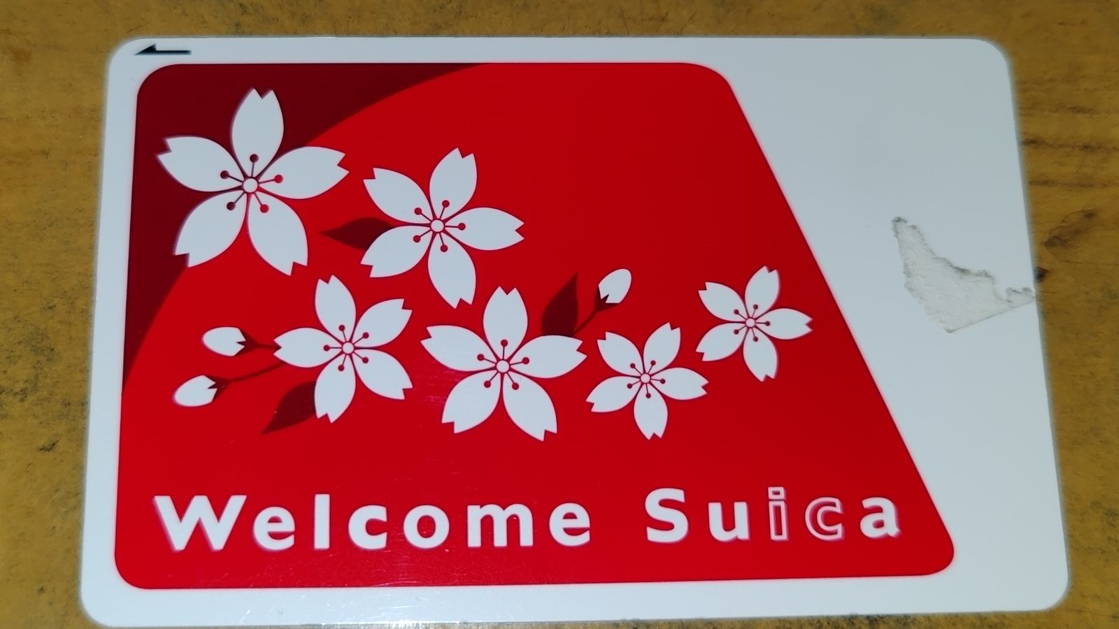
How to Choose Tokyo Transit Passes: Are Suica, Welcome Suica, the Tokyo Subway Ticket, and the JR Pass Worth It?
On a first Tokyo trip, start with an IC card and pay per ride (Welcome Suica has no deposit and is valid for 28 days). If you take four or more subway rides in a day, add a 72-hour Tokyo Subway Ticket for 2,000 yen; a JR Pass is never worthwhile if you stay in Tokyo and do not go to Kansai. See what TOURIST PASMO, Suica on iPhone, and the Tokyo Metro day pass do and do not cover, with a decision chart. Prices verified in September 2026.
- Transport
- Budget

GuideTokyo
Tokyo Disneyland and DisneySea Guide: Ticket Prices, Fantasy Springs, Disney Premier Access (DPA), Standby Pass, and Which Park to Choose for Your First Visit
Tokyo Disney one-day Passport prices vary: most weekdays in 9/2026 cost ¥9,900 and weekends ¥10,900. At 14:00 daily, tickets go on sale for the same date two months later. Free Priority Pass is no longer on the official service list; only paid Disney Premier Access (¥1,000–3,500 per person per use) shortens waits. Covers hours, the 25th anniversary, Standby Pass, Entry Request, Fantasy Springs access and first-visit park choice; checked on the official site in 9/2026.
- Itineraries
- Family
Sources
- WordPress: Block-based Widgets Editor · Checked:
- WordPress: Classic Widgets Screen · Checked:
- MDN: CSS positioning · Checked:
- WordPress: Site Editor · Checked: