Lifestyle
Claude Starts Drawing Interactive Visuals: Understand the Assumptions Before the Concept
Exploring Claude's interactive visual features launched in 2026, analyzing water tank inflow-outflow and dual-mode commute scenarios, and providing key chart verification methods across axes, boundary values, and accessibility semantics.
Updated: About 8 min read
Event date: 2026-03-12; verification date: 2026-09-14. Announced in beta on March 12, Claude can generate adjustable charts, diagrams, and interactive visuals within conversations, available across all plans at the time.
The official team distinguishes between transient interactive visuals within conversations and persistent, shareable, downloadable artifacts; the two serve different purposes. Support documentation states these visuals are generated using HTML/SVG, which is not equivalent to photo- or painting-style image generation. An update on April 22 noted that it is also available for all paid Cowork plans; the initial launch and subsequent expansions should be distinguished. The following everyday and workplace scenarios are editorially designed examples for readers to verify on their own, rather than hands-on product tests by this site.
Water Tank Inflow-Outflow Model: Defining Units and Capacity Boundaries
To understand the operational logic of dynamic charts, one can set up a water tank inflow and outflow scenario. We begin by explicitly specifying a maximum tank capacity of 1,000 liters, an inflow pipe bringing in 30 liters per minute, and an outlet valve releasing 20 liters per minute. Before building interactive sliders, the measurement units and numerical ranges of these parameters must be strictly defined to ensure that dragging the controls will not cause the model to output a physically meaningless negative capacity, thereby keeping the computational foundation transparent and rigorous.
When we slide the outflow rate up to 40 liters per minute, the dynamic chart instantly reflects a downward trend in stored water volume. At this point, the key test is guiding observers to verify whether the change in slope accurately corresponds to the net difference between the two flow rates. By adjusting a single variable step by step, we can check whether the visualization model faithfully reflects each computational step in the chart's slope, preventing unexplained underlying black-box calculations from obscuring the actual derivation of fluid conservation.
The advantage of graphical representation lies in translating abstract formulas into continuous dynamic processes, yet users still need to carefully examine boundary handling. When outflow consistently exceeds inflow, whether the chart automatically ceases drainage once the water level hits zero liters serves as a critical indicator of whether the model's logic is sound. If the values continue extending into negative territory on the graph, it indicates that the structure is merely a superficial symbolic animation that fails to enforce physical constraints and boundary checks in the underlying code.
Dual-Mode Commute Comparison: Testing Variables and Extreme Scenarios
Another practically valuable everyday case is comparing commute times between taking the MRT and driving. In setting up the model, we configure the MRT as a fixed 35-minute ride plus a 5-minute walk; driving is set as a 20-kilometer route paired with two dynamic variables: average driving speed and traffic delay. As users slide to raise the traffic congestion coefficient on the interface, they can observe in real time the shifts in total travel time and the break-even intersection between the two transit modes across varying levels of congestion.
When conducting comparisons, one must demand that the system fully disclose all assumed values. For instance, when simulating heavy rain that reduces driving speed to 15 kilometers per hour, does the driving curve also factor in an extra 10-minute variable for finding a parking spot? If the interactive chart merely reduces driving speed while ignoring parking overhead, the estimated commute time will be severely distorted. Therefore, verifying the variable interaction logic item by item is far more pragmatic and necessary than merely watching chart transitions.
By fine-tuning the control sliders, users can clearly identify the critical threshold where travel times are identical. For example, under a specific delay condition, the total driving time reaches exactly 40 minutes, which marks the tipping point for altering transit decisions. The core of scenario comparison lies in variable sensitivity analysis; only when all scenario assumptions and extreme settings are fully accounted for can interactive charts serve as valuable decision-support tools rather than one-sided illustrations lacking real-world context.
| Dimension | Potential Visual Bias | Verification Method |
|---|---|---|
| Axis scale | Truncated axes artificially magnify minor fluctuations | Check origin, scale intervals, and use of logarithmic or other scales; verify against raw values if needed |
| Slider bounds | Extreme parameter inputs cause arithmetic overflow or distortion | Push controls to minimum and maximum extremes to test whether reasonable fail-safe limits are present |
| Variable linkage | Adjusting a single factor while ignoring realistic associated costs | Check whether formulas include related constants to prevent logical gaps in underlying conditions |
| Semantic markup | Pure graphical animations lack screen-reader text support | Inspect underlying code for accessibility text and verify real-time state synchronization |
Axes and Scaling Traps: Identifying Visual Distortion from Truncated Axes
As charts transition from static to dynamic interactivity, scale design often becomes a hotspot for visual misdirection. The most common occurrence is the truncated axis, where the vertical axis does not begin at zero, but instead starts from a high baseline close to the data floor. This practice artificially amplifies minor numerical differences, making what is merely a 2% fluctuation in time appear as a steep, near-doubling trend on a bar or line chart, severely undermining the user's intuitive judgment.
To ensure honest communication of information, verifying the interval spacing on both vertical and horizontal axes is a primary task. If a chart supports zoom interactions, users must especially verify whether the axes arbitrarily reset their baseline as sliders move. Seeking visual tension, some systems automatically narrow the vertical range upon minor value changes, creating the illusion of dramatic fluctuation. Actively checking axis graduations is essential to confirming the actual magnitude and proportional change represented by each unit of geometric distance.
Scales do not necessarily have to be linear, nor do line charts always have to start from zero, but the applied method must be clearly labeled. Portraying a five-minute interval and a half-hour interval with identical visual spacing without explanation leads readers to misinterpret the rate of change. When reading charts, one should simultaneously examine scales, units, and values; to compare relative differences, one can also request an alternative scale or raw data tables from the tool to verify whether the conclusion still holds.
Interactive Boundaries and Extremes: Identifying Blind Spots in Sliders
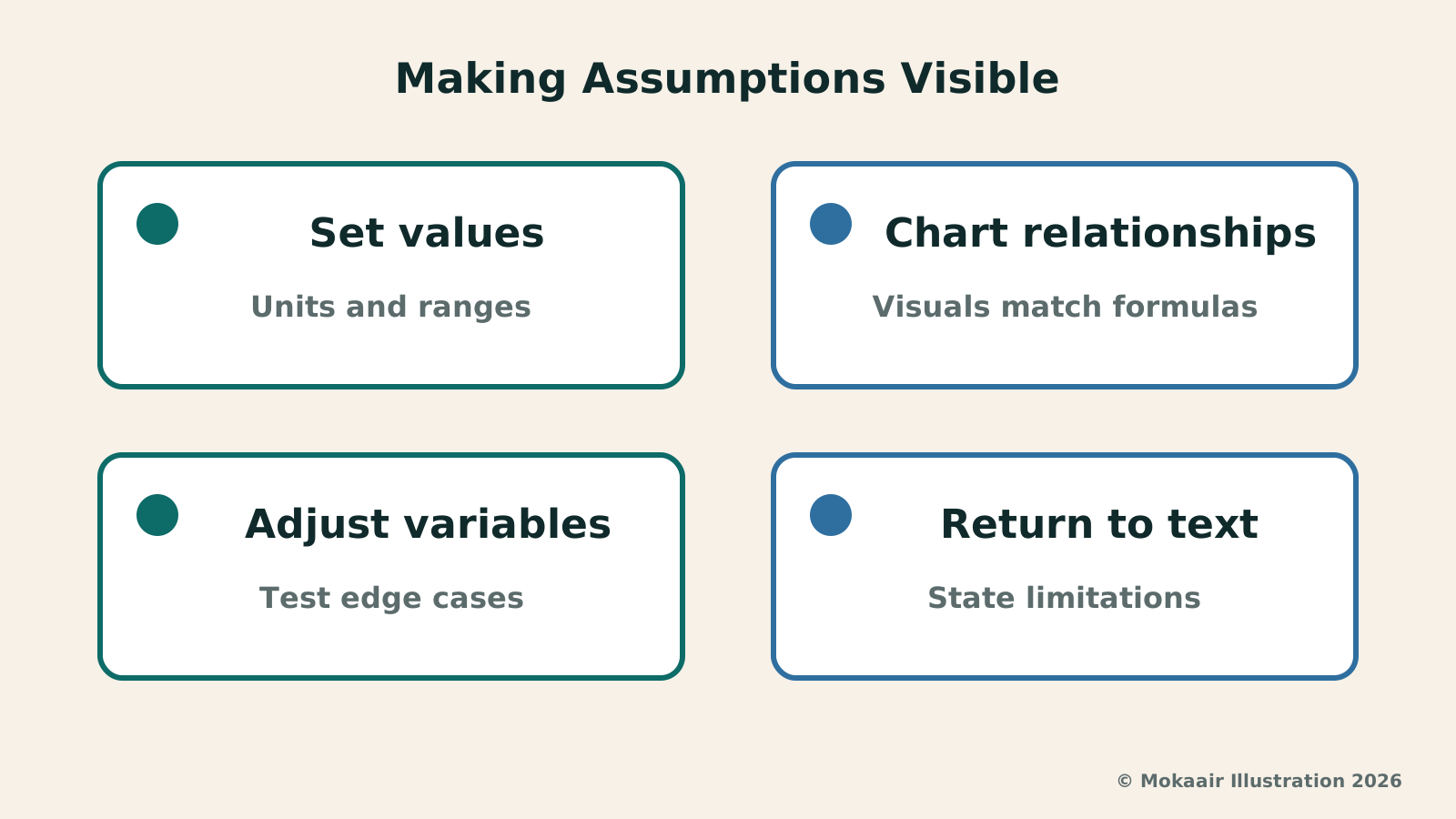
The core value of interactive visual components lies in granting users the flexibility to adjust parameters, yet the upper and lower limits of controls often harbor blind spots in model design. Taking water tank capacity and commute times as examples, if sliders allow negative numbers or extend outward without limit, absurd curves divorced from reality will emerge. The first step in verifying such charts is pushing sliders directly to their leftmost and rightmost extremes to examine whether the system's computational logic crashes or yields invalid numbers at extreme bounds.
In the water tank scenario, the outflow rate may temporarily exceed the inflow rate, with the deficit offset by existing stored water; the true boundary is that once the tank is empty, it cannot continue deducting into negative volume. In the commute model, one must check whether explicit prompts appear when driving speed drops to zero or when dates or units are missing. Such edge-case testing uncovers assumptions left unstated by formulas, rather than merely verifying whether sliders can be dragged.
Accessibility Text and Semantic Markup: Making Underlying Logic Readable
These interactive visuals are constructed in real time using web standard technologies like HTML and the SVG vector format, essentially functioning as structured code rather than closed static images. Under this framework, whether the system provides robust accessible text descriptions and semantic tags becomes a key indicator of professionalism. Readers and assistive tools should be able to directly and accurately read the current numerical state and variable relationships of the chart through plain text descriptions.
A well-crafted dynamic chart should update the underlying annotated current water volume or dual-mode total commute time synchronously as sliders adjust values. Plain text descriptions compel the creator to articulate premises easily overlooked visually, such as unit conversion standards or error margins. Only when dynamic graphic shifts align perfectly with the data in accessibility text annotations can readers confirm the chart possesses a rigorous structure, and that its conclusions are not visual sleight of hand, but well-reasoned analytical results.
2026 AI News Roundup: Highlights and Daily Life Applications from January to September2026 AI News Roundup: Highlights and Daily Life Applications from January to SeptemberOrganizing key AI news stories month by month from January to September 2026, linking to full analyses in five languages. Covering models, work tools, creation, costs, and transparency, explaining backgrounds, uses, and limits.Read the full article
Lyria 3 Pro Extends AI Music Creation: From Short Clips to Structured CompositionsLyria 3 Pro Extends AI Music Creation: From Short Clips to Structured CompositionsAnalyzing structured long-audio composition with Lyria 3 Pro: using a community film festival soundtrack case study to explore workflows and review checkpoints across intros, verses, choruses, and voiceover clearance.Read the full article
Lifestyle
NVIDIA launches DGX Spark 64GB: on sale October 23 from $4,999, two units can be linked into 128GB
On October 2, 2026, NVIDIA announced a more affordable 64GB memory version of its DGX Spark personal AI computer, available from October 23 through six makers including Acer and ASUS. It is aimed mainly at developers and researchers who want to run AI models on their own machines. Below we summarize the specs NVIDIA published, its claims about linking two units, and what it means for general readers.
Lifestyle
Google Cloud Launches Spanner Queues: Putting Message Queues Inside Database Transactions to Make AI Agents More Reliable
Google Cloud has announced the general availability of Spanner queues, which make message creation part of a database transaction. The aim is to stop AI agents' "state" and "actions" from falling out of sync. This article covers Google Cloud's claims, the main features, and what it means for general readers.
Lifestyle
GPT-6.1 Sol Launches: New Sol Version in the API, Codex and ChatGPT Work, Not in Chat
OpenAI launched GPT-6.1 Sol on September 29, 2026, with the API name gpt-6.1-sol. The launch rollout covers Codex and ChatGPT Work on Plus, Pro, Business, Enterprise and Edu (Enterprise and Edu need an administrator to enable it); Free and Go are not included at launch, and it is not in Chat (checked September 2026).
Lifestyle
Claude Sonnet 5.5 Launches: Same List Price as Sonnet 5, Available in the API, on Cloud Platforms and in Claude.ai
Anthropic launched Claude Sonnet 5.5 on September 28, 2026. API list prices are the same as Sonnet 5 ($2 per million input tokens, $10 per million output tokens). It is available in Claude.ai, the API and several cloud platforms, and higher-risk cybersecurity requests fall back to Sonnet 5 (checked September 2026).
Articles that cite this one
Latest travel guides

GuideTokyo
Where to Stay in Tokyo: Comparing Shinjuku, Ueno, Tokyo Station, Shibuya, Asakusa, Ikebukuro, and Ginza, Plus Airport Access, Accommodation Tax, and Luggage Delivery
Where should you stay in Tokyo? Compare Shinjuku, Ueno, Tokyo Station, Shibuya, Asakusa, Ikebukuro, and Ginza by the same criteria: access from Narita and Haneda, transit routes, nearby attractions, neighborhood character, and who each area suits. Includes a comparison table, a Yamanote Line diagram, Tokyo’s accommodation tax as verified in 2026/9 (changing to 3% in 2027/4), and Airport TA-Q-BIN luggage shipping rules.
- Budget
- Hotels

GuideTokyo
How to Choose Tokyo Transit Passes: Are Suica, Welcome Suica, the Tokyo Subway Ticket, and the JR Pass Worth It?
On a first Tokyo trip, start with an IC card and pay per ride (Welcome Suica has no deposit and is valid for 28 days). If you take four or more subway rides in a day, add a 72-hour Tokyo Subway Ticket for 2,000 yen; a JR Pass is never worthwhile if you stay in Tokyo and do not go to Kansai. See what TOURIST PASMO, Suica on iPhone, and the Tokyo Metro day pass do and do not cover, with a decision chart. Prices verified in September 2026.
- Transport
- Budget

GuideTokyo
Tokyo Disneyland and DisneySea Guide: Ticket Prices, Fantasy Springs, Disney Premier Access (DPA), Standby Pass, and Which Park to Choose for Your First Visit
Tokyo Disney one-day Passport prices vary: most weekdays in 9/2026 cost ¥9,900 and weekends ¥10,900. At 14:00 daily, tickets go on sale for the same date two months later. Free Priority Pass is no longer on the official service list; only paid Disney Premier Access (¥1,000–3,500 per person per use) shortens waits. Covers hours, the 25th anniversary, Standby Pass, Entry Request, Fantasy Springs access and first-visit park choice; checked on the official site in 9/2026.
- Itineraries
- Family
Sources
- Claude: Interactive Visuals Launch · Checked:
- Claude Help: Can Claude produce images? · Checked: